Sector Engagement and monetization Commenting Content Engagement Video
Challenge Add new features and user interactions to the commenting unit. provide an overview of all the comments and threads with a goal to get both known users and Observers more engaged.
My role
Mobile + desktop mockups, color mapping and matching to customers brands, detailed IX states (hovers, clicks, animations, transitions, etc.), error messages and warnings, Isolated assets for exporting
Success Metrics
Engage a broader audience. Encourage users to sign up for new accounts. Provide insights into users’ discussions in order to maintain liveliness and interest.
Analyzing the existing solution
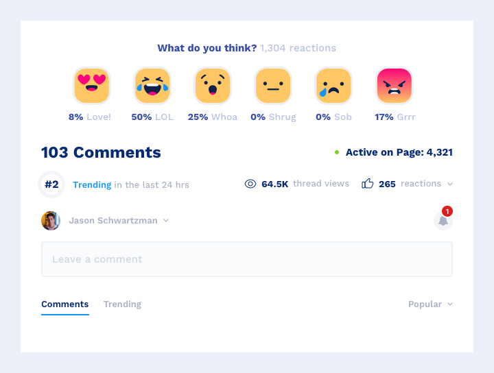
The original intent of the commenting unit was to provide users with the ability to leave a comment under an article and view comments and replies left by other users. There were only two metrics available to users: the number of comments and replies left by users and how many users are currently active on the given page. Additionally, there is also an option for adding reactions but only on the level of an article. Emojis from the regular emojis library were used for reactions on the comment level. As a result, comment reactions weren’t unique or branded.
Overview section will be available for all publisher articles where commenting is enabled and will be places above the commenting tree.
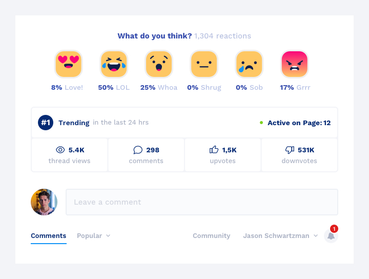
Overview will include the total count of comments for the thread for the entire time the article has been available.
To the right of the comments count, keep the “Active on Page: #” count.
Below the comments count metric, we show a “Trending Now” number if the article is in top 10 trending articles based on how many comments and or reactions it received.
The time period for “Trending” will be driven by the configuration which has 24 hour, 7 days, and 1 week as options. “Reactions” are to be a sum of comments, replies, upvotes, downvotes, article reactions and emojis for both known and unknown users, where applicable given the default timeframe.
Next to “Thread Views” show another new metric called “Reactions” displaying a count of total reactions for the article since it was released.
Overview section design iterations (enhancement)
Once all the objectives in the brief are clarified, I’ve made a few versions of the commenting overview UI that reflected all the requirements. But, as the team became more comfortable with visuals, requirements changed several times and the final design became more compact and editorial.
Commenting overview IX states
Top Comment (new feature)
The feature aims to create a sense of competition and more high-quality content.“Top comments” ranking is determined by the total number of replies to an original comment. To reduce screen real estate usage especially on mobile devices, initial state will only display the first two rows of text. The “Show more” button will expand it to display the rest of the comment and up to 5 replies. The top comment should not be updated more than once an hour or every time the user reload the page. By default, the feature will be enabled, but it can be turned off from the publisher admin.
Top terms (new feature)
Show up to five top terms used in comments and replies across the thread to allow users to filter out comments containing specific terms.
Comment reaction emojis (new feature)
As part of the “Overview” project, we decided to redesign the “emoji sticker” (i.e. emoji reactions to individual comments).
These are the goals of this task, at a high-level:
Remove the current library of 100+ emojis for users to ‘react’ to individual comments (concerns about toxic use of some emojis, as well as metrics showing low usage of the feature).
“Bundle” or “combine” the actions of “Upvote” and “Downvote” with s brief set of “emotions” to give the user a streamlined set of options for them to react easily to an individual comment.
Leverage the simplified “reactions” to be visualized in the Overview section together with other key metrics about that particular section.
As a standard component of the UX process, I build information architecture when building products. Determining every avenue and direction that users can take through an app or website, information architecture is much beyond just a sitemap to show what page leads where.
Results and takeaways
The purpose of this workshop is to engage commenters in a more proactive manner, aligning more closely with the longer-term goal of being a more data-focused product.
Key drivers of the updates are:
Differentiation – goal is to try to add some differentiation and value so prospects that already have commenting have a reason to switch.
Improve experiences in order to collect standardized data on customers and broader customer base for benchmarking.
Focus on Observers to understand their behavior with the purpose of getting them engaged and ultimately creating an account.
Simplify the UI by removing features that people aren’t using.