Sector
HVAC manufacturer
Industrial
Air curtains
Research and development
Challenge
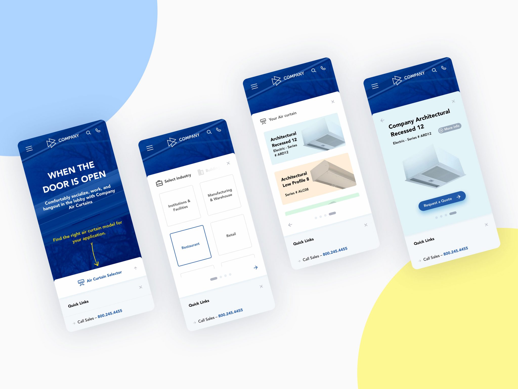
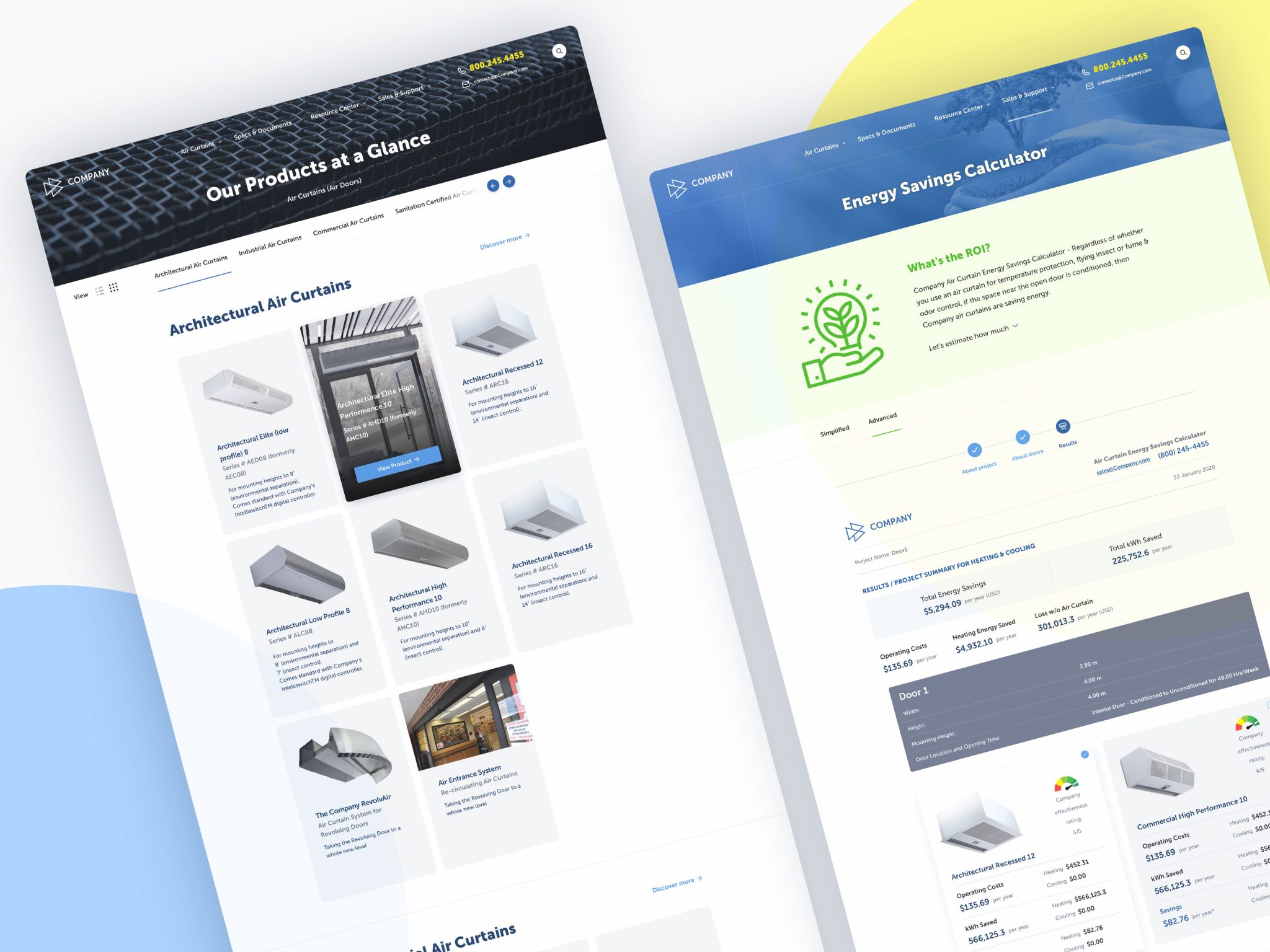
Redesign the experience for company customers, focusing on the way in which they browse product catalog, select right product and request a quote to boost engagement on the website.
My role
User research and testing, user flow and journey mapping for different personas, information architecture, prototypes and mockups design.
Success Metrics
Decrease average time users spend on a website looking for products and requesting price quote.
Maintain customers retention and commitment.
Understanding the existing interface
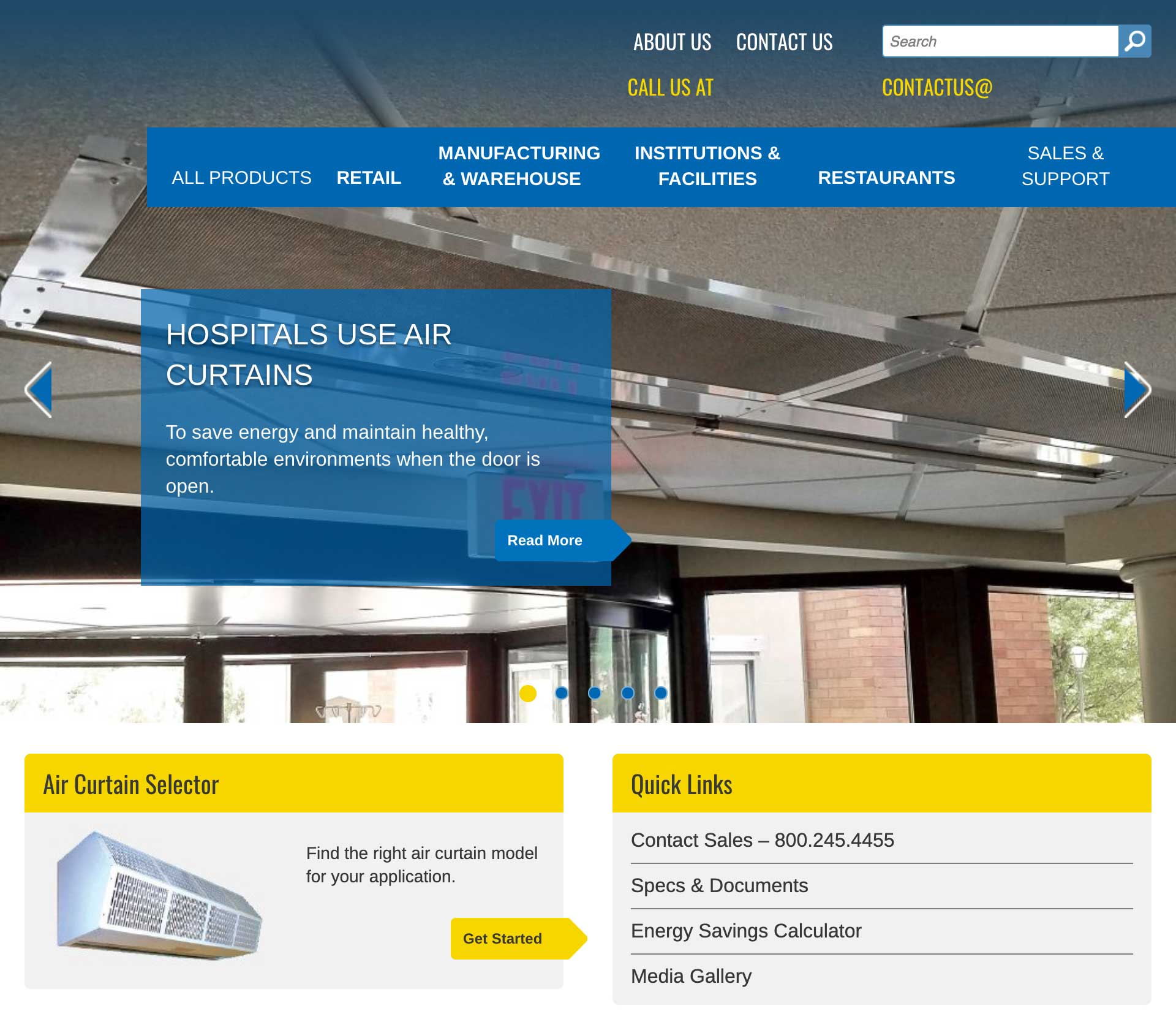
The previous version of a website had a content slideshow as the main UI element with autoplay set to on. The main menu isn’t very intuitive and had a boxed layout which caused menu items text to wrap and expand its height and pushing the rest of the page down. The top part of the navigation felt redundant and had duplicated items. The brand offered a few main industries as a major part of navigation. Some important menu items were hidden under the dropdown menu and required additional user interaction. The layout is somewhat confusing and not revealing essential content that could potentially generate leads or familiarize site visitors with brands’ products and services.
UI elements didn’t have enough space between them.
The content was written mainly for SEO optimization purposes rather than to be user friendly and promoting the brand.
Main CTA is contact sales and download product specifications and documentation which creates a feeling the website is built solely for technical people who’s already familiar with the product catalog.
Design process
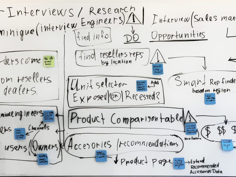
Before starting my design work, I communicate with stakeholders to make sure we are all aligned on the goals of the product, overall project scope, and research on the target user. Therefore, I always set up an interview meeting between the product owners, engineers, and marketing strategy teams. I find it useful to map out the customer journey of the product and to discover the opportunity areas. Create efficient concepts, flows, and experiences.
Goals
What do you want to accomplish with the Website?
Audience
Who is the Website for?
References
What other Websites resemble what you want to have?
Rules & Limitations
Are there any rules & limitations?
Persona
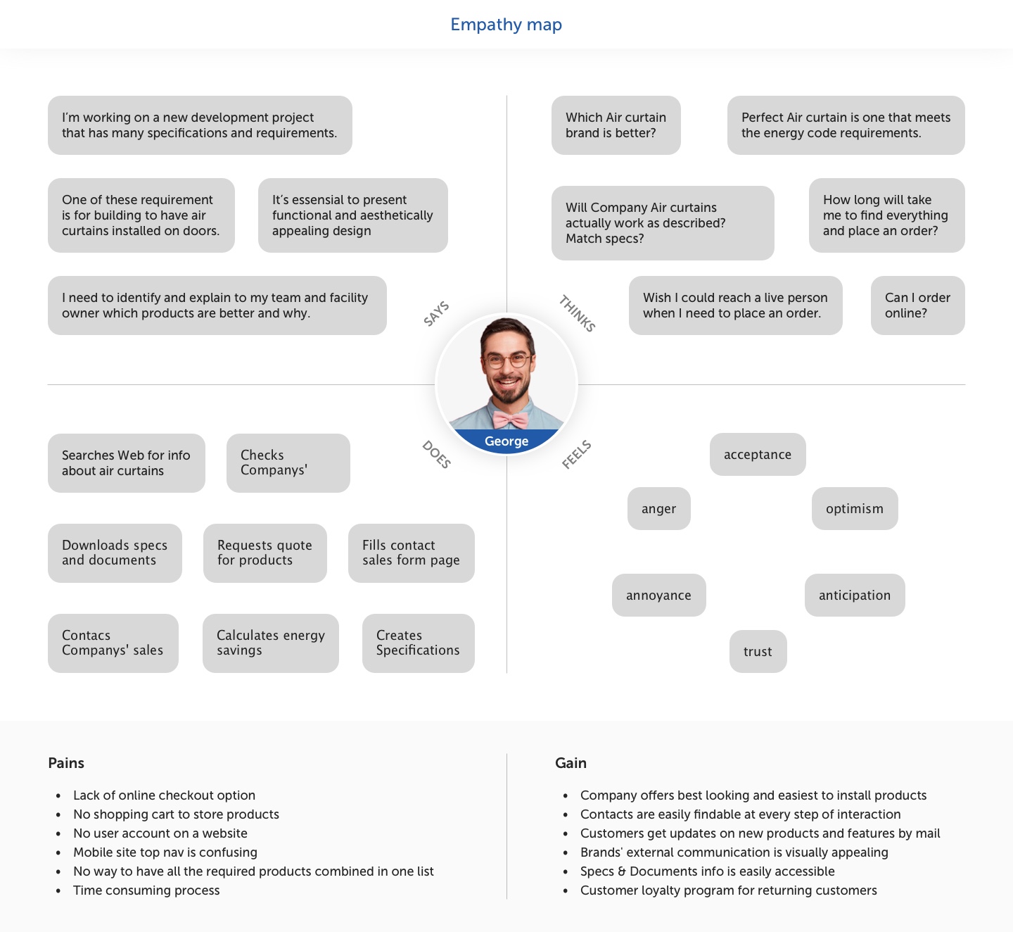
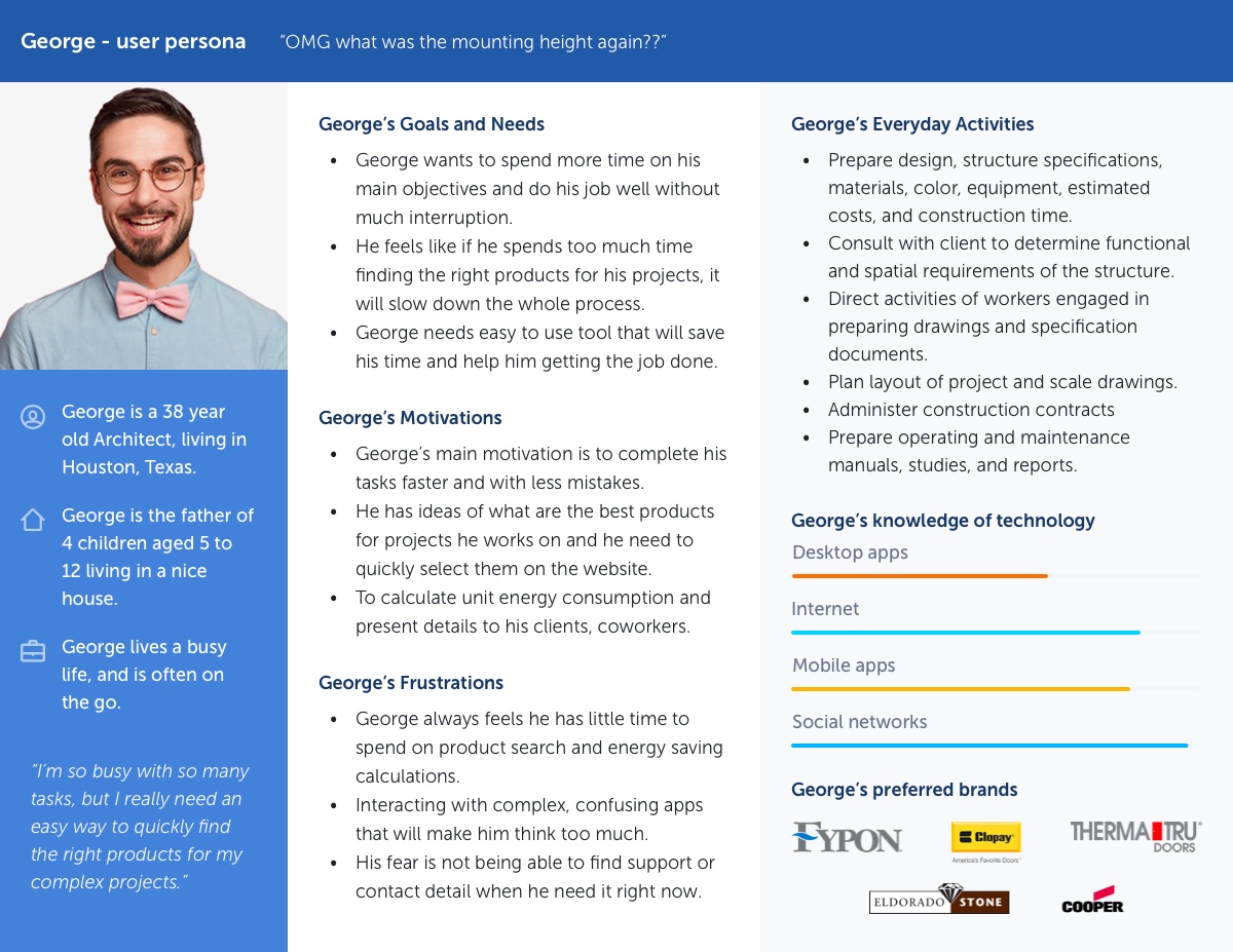
To better understand the various types of users, I created so-called proto-personas, which are based mostly on industry knowledge and assumptions. These serve as a starting point to reflect on the needs and problems of the user and potential solutions that can be considered in developing the information architecture.
Customer Journey Map
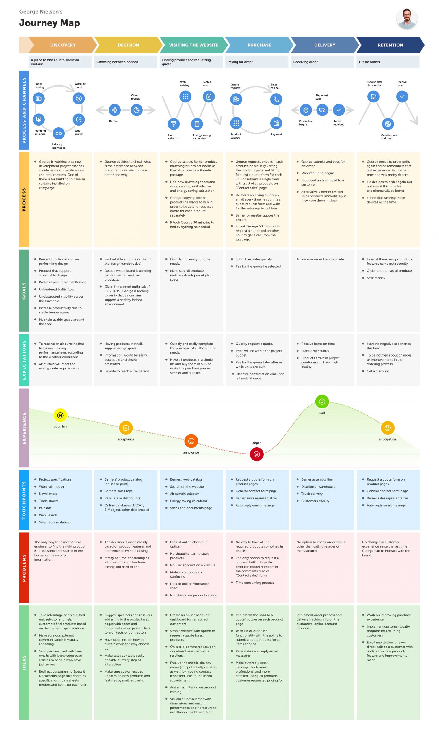
Based on the findings received from user research, I built a detailed customer journey map that shows users’ processes, goals, expectations, and emotions at every touchpoint of interaction with the brand. This helped me to outline ideas of how to improve the users’ experience and eliminate as many pain points as possible.
Wireframing and Prototyping
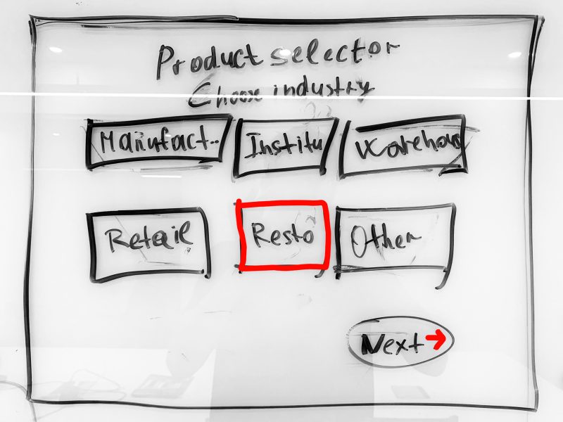
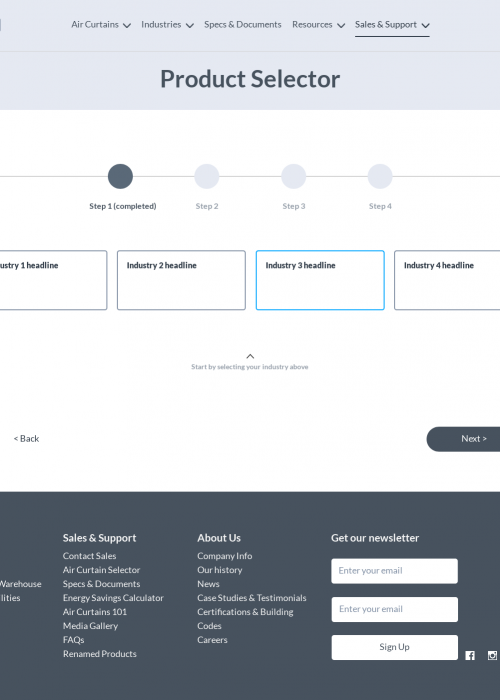
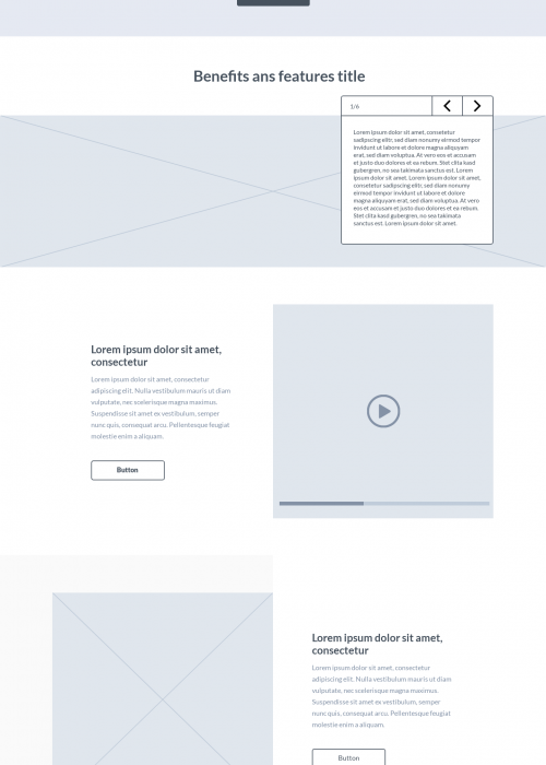
The wireframing and prototyping stages were critical in shaping the final design of the corporate website redesign. I exclusively utilized Figma, a leading digital design tool, to create both the wireframes and the high-fidelity interactive prototypes.
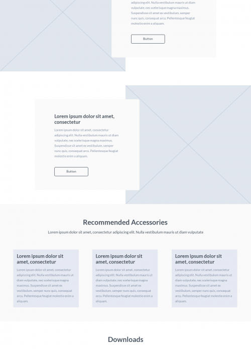
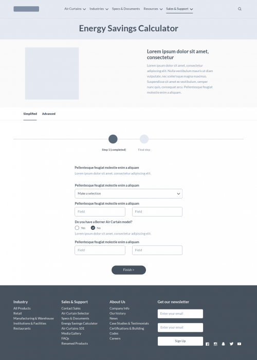
During the wireframing process, I meticulously constructed the website’s structural framework, prioritizing logical flow and intuitive navigation in accordance with best UX practices.
These wireframes served as a visual blueprint, illustrating the layout and functional elements of the website, and providing a clear guide for all subsequent design phases.
Transitioning to prototyping within Figma, I developed interactive and detailed prototypes that brought these wireframes to life. This allowed for an engaging and dynamic presentation to stakeholders, offering them a hands-on experience of the proposed design. The interactive nature of these prototypes facilitated immediate and actionable feedback, enabling swift iterations that were essential for refining user experience and functionality.
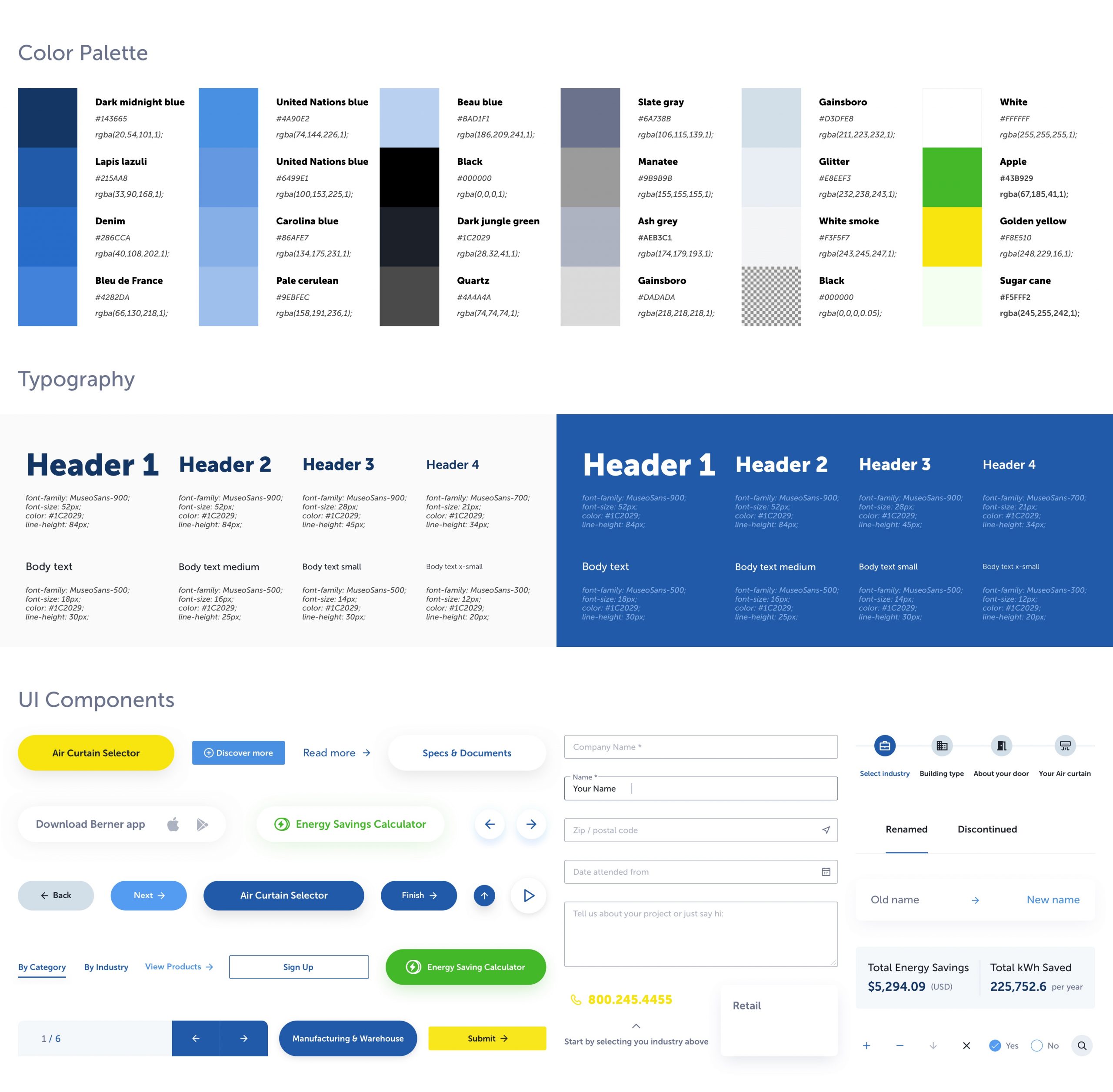
This focused approach using Figma ensured that each design decision was grounded in user-centered research and stakeholder feedback, culminating in a design that was not only visually appealing but highly functional.
Results and takeaways
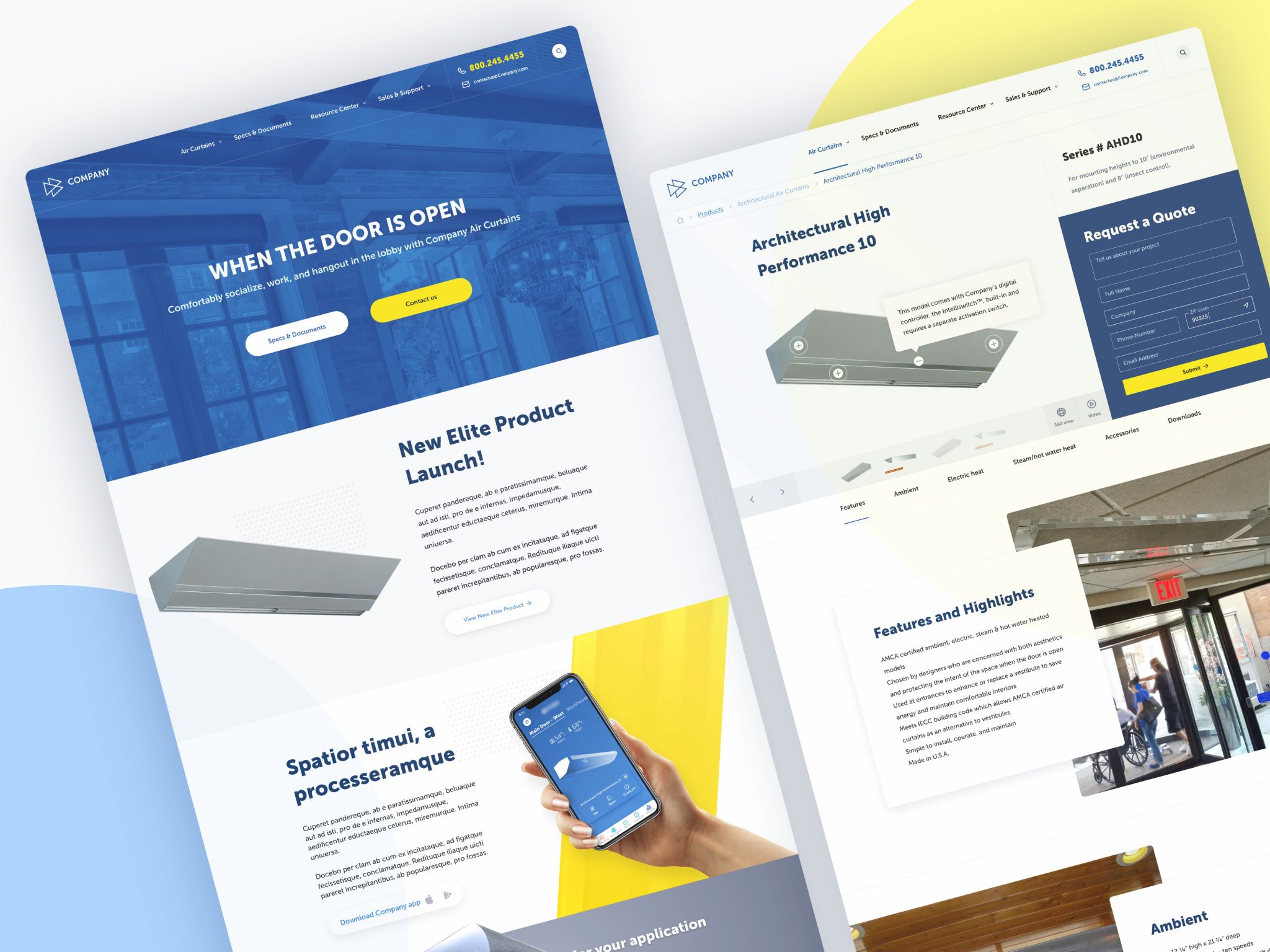
Since the launch of the new rebuild of the corporate website, we’ve seen a significant decrease in the bounce rate logged through the visitor behavior analysis. Also, I have received positive feedback from users about the streamlined navigation through the website and better content scanability, enabling smoother and faster product searches, saving them time and effort. Some mentioned that the website looks and feels more polished.


