Revitalizing a Headless CMS: A Journey of Insight, Adaptability, and Growth.
The Challenge
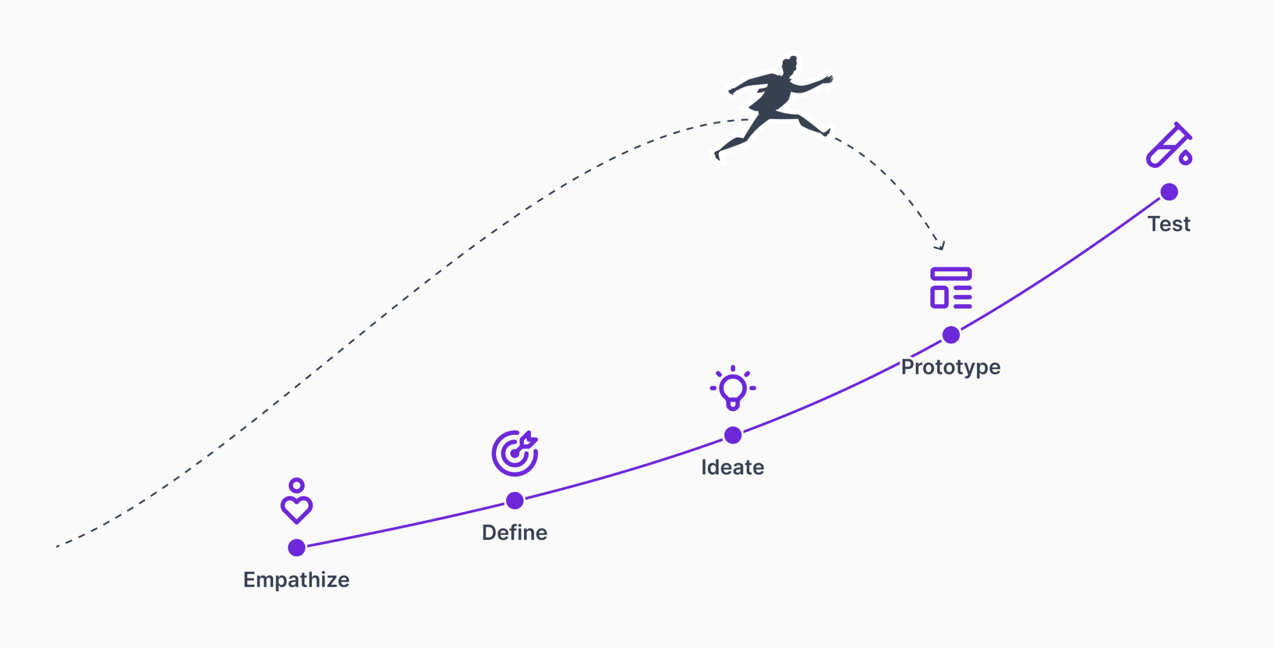
The design process for this headless CMS project did not follow the structured methodology typically outlined in UX frameworks. We moved directly into prototyping to rapidly revamp the UI, bypassing the initial stages of user research. This approach reflected the CMS’s early stage in adopting UX maturity, with a focus on enhancing aesthetics rather than deeply understanding the user journey. While the goal was to improve the user experience, it became clear that we were beginning to integrate a mature UX process into the product’s development lifecycle, marking a shift toward a more user-focused approach.
Role and Contributions
As a Product designer, I steered the project from idea to post-launch improvements. I aligned the goals and key priorities of the redesign with design, development, and customer success teams, and coordinated cross teams herein. In order to build a cohesive experience, we worked with the team to build the “Plenum” design system, building a user-centered framework that would grow with the CMS.
Although there was no discovery phase, user research became a central part of the process. At each stage, I conducted surveys, interviews and usability tests, and organized and analyzed the feedback.
We ran Pixel Perfection workshops with developers enabling us to stay on track with design integrity from the prototype to the final product.
During the project, I continuously thought about how to prioritize and put user needs at the centre of everything I did, and every lever of design had to be deliberate and ensure more value for the overall experience.
Success Metrics
To gauge the redesign’s impact, we tracked several metrics that provided insight into usability and user engagement:
User engagement metrics captured session duration, page views, and the frequency with which users returned, helping us understand how well users navigated and engaged with the CMS.
Task completion rates showed how efficiently users were able to complete essential tasks, offering a clear view into the CMS’s usability.
Accessibility compliance with WCAG 2.1 standards ensured the CMS was inclusive, meeting the needs of a diverse user base.
User satisfaction scores gathered through surveys and interviews after launch offered feedback on what resonated and where improvements were still needed.
Reduced support requests for usability issues indicated that our design addressed common pain points and enhanced the overall user experience.
Gaining Deep Insight: Understanding the Existing Solution
I started by submerging myself into the CMS we were working within to understand its capabilities, but also where the gaps were. I was interested in exploring if the platform could offer a more meaningful experience for users instead of purely around aesthetics. However, what I discovered in this exploration were both features that work and the innovation potential, insights that went well beyond visuals. I looked into user input, i.e. what they need the system to do, and studied the current design just to understand what type of improvements would be the most effective, concentrating on features that improved the CMS’s functionality and made it a more delightful experience.
Enhanced UX Research with Feedback Loops
To keep users throughout the design process, I facilitated continual feedback loop using qualitative and quantitative research in parallel. User interviews and usability tests gave us a direct line of dialogue with users to provide feedback to shape the design of each iteration. It gave us a real feel for what the user requires and what blocks them.
Surveys and analytics helped provide broader insights into user behavior which gave us a pattern and preferences that we could use as a specific area of improvement. Together, these qualitative and quantitative approaches yielded a robust feedback system in which we could pick up real user needs and tailor each update accordingly.
Feedback-Informed Design Enhancements
The insights from user feedback drove several critical improvements across the CMS, enhancing the experience to make daily tasks more accessible.
Home Dashboard: The dashboard was simplified to prioritize essential tools, making navigation easier and giving users a more organized starting point.
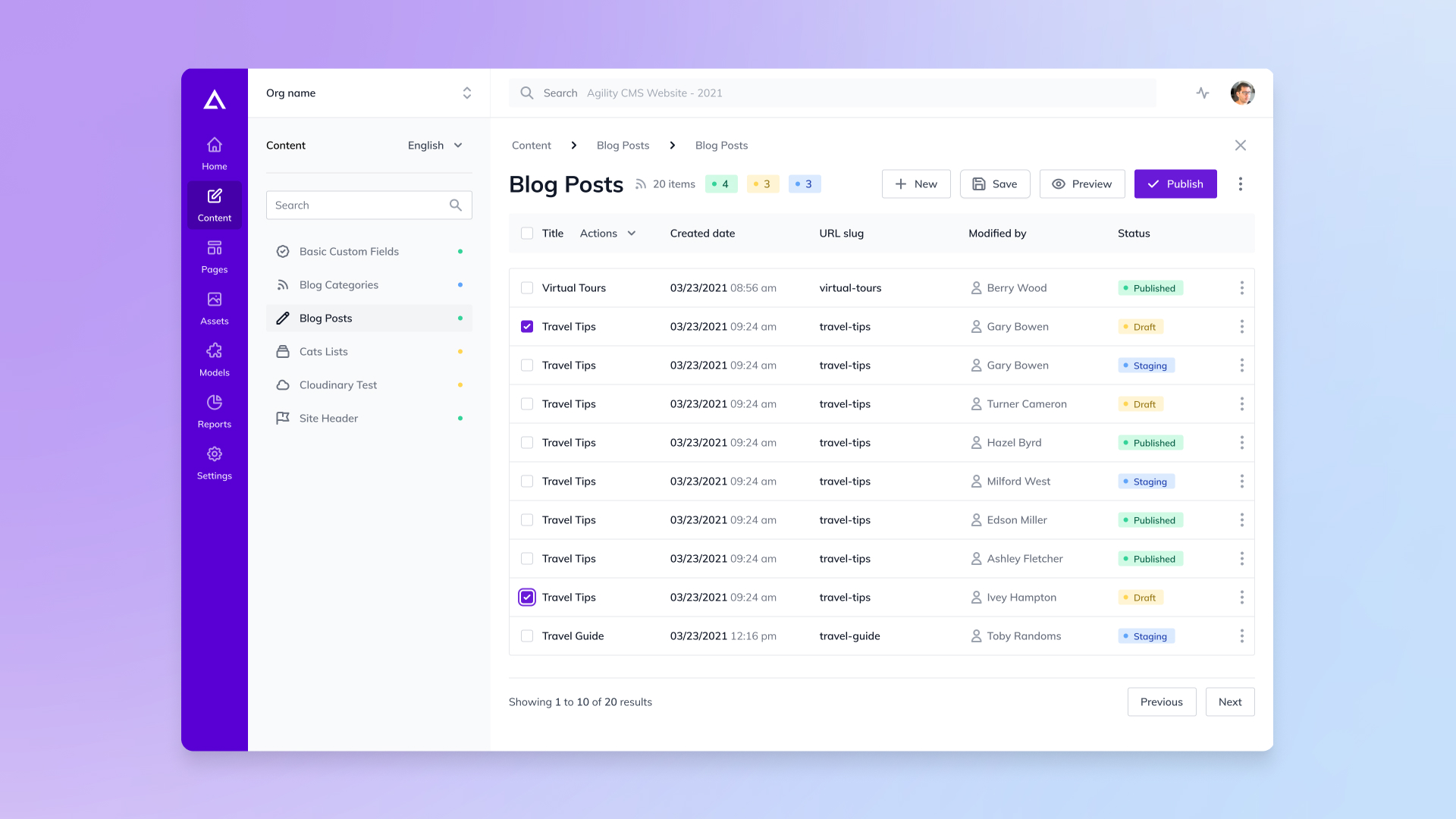
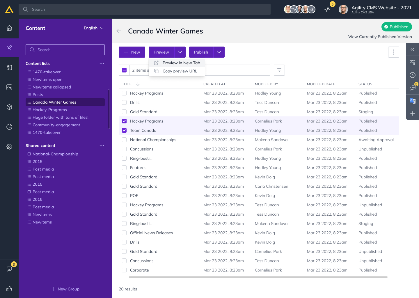
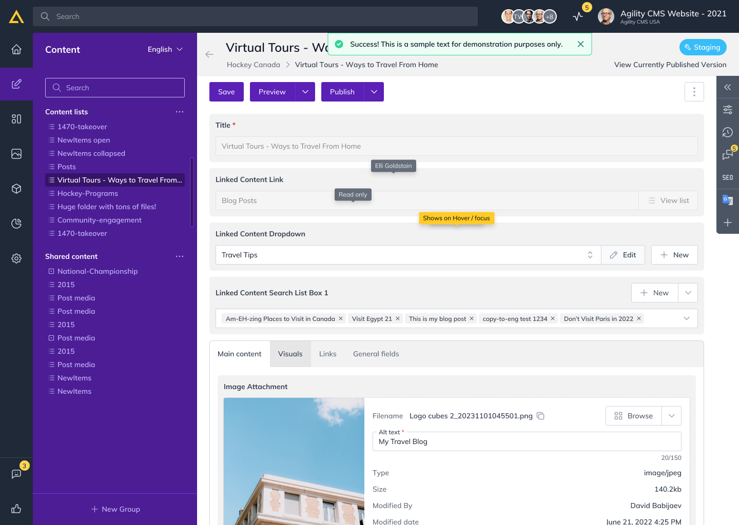
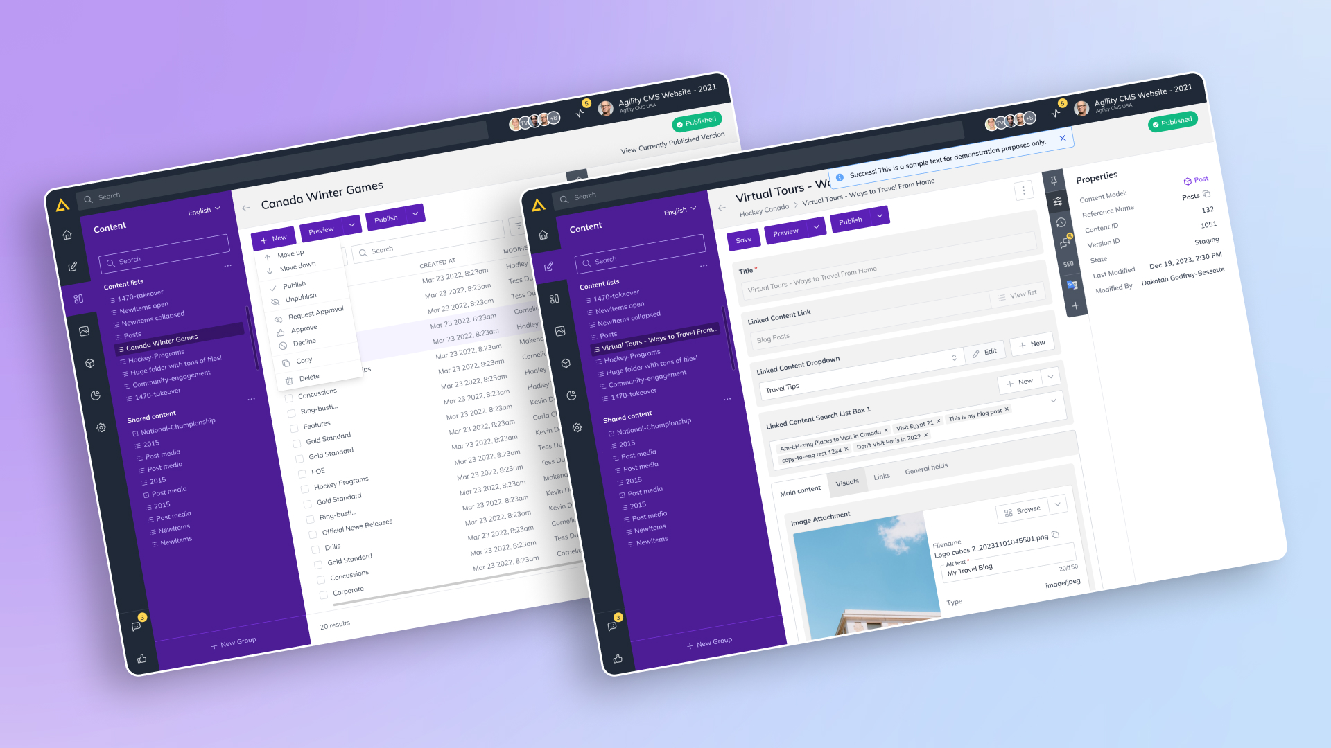
Content Management: We redesigned the content management view to make workflows smoother, reducing the steps required to complete tasks and creating a more intuitive experience.
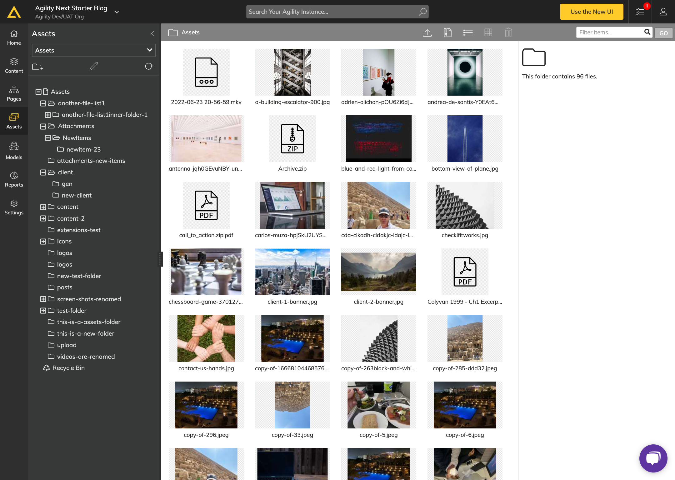
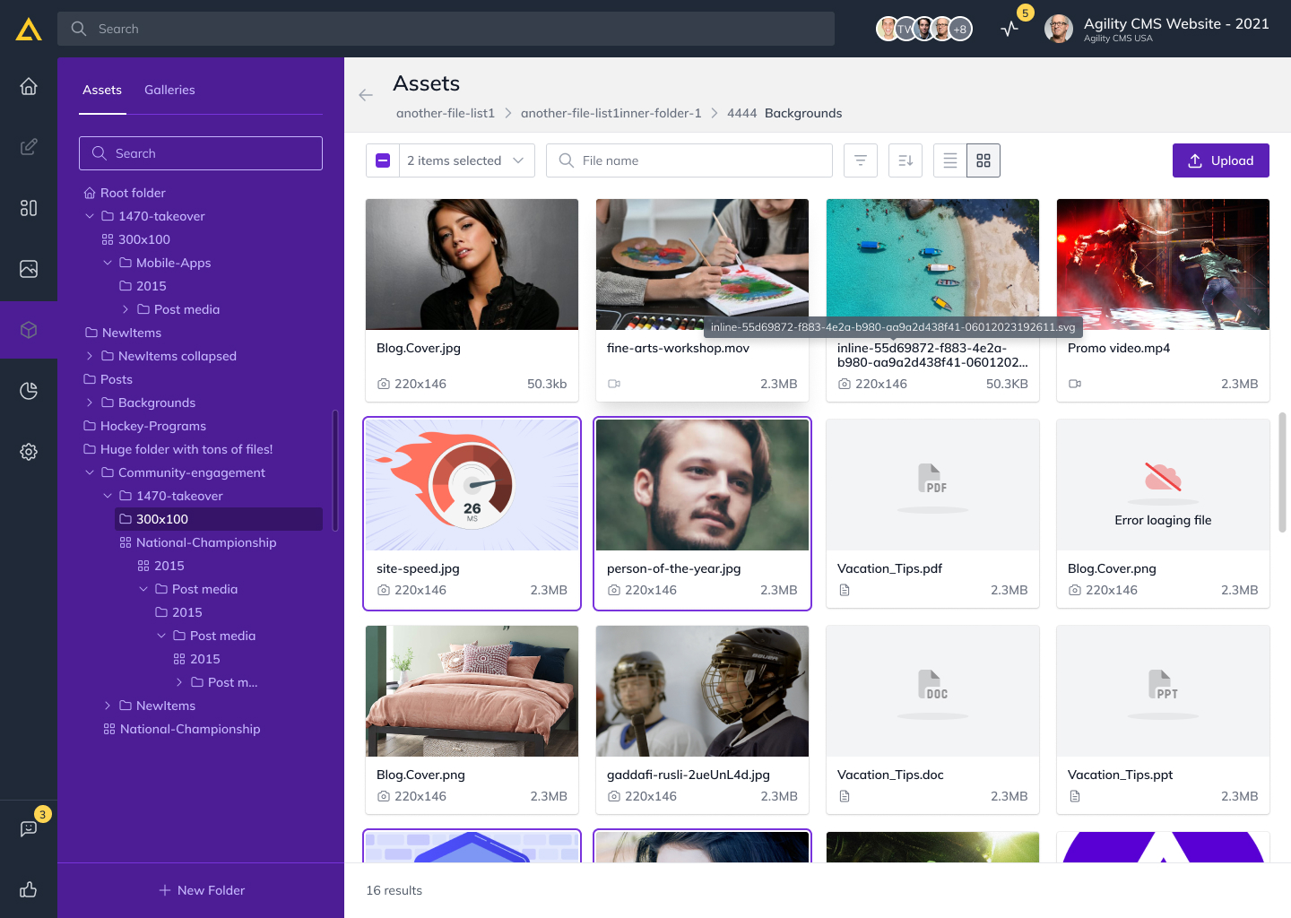
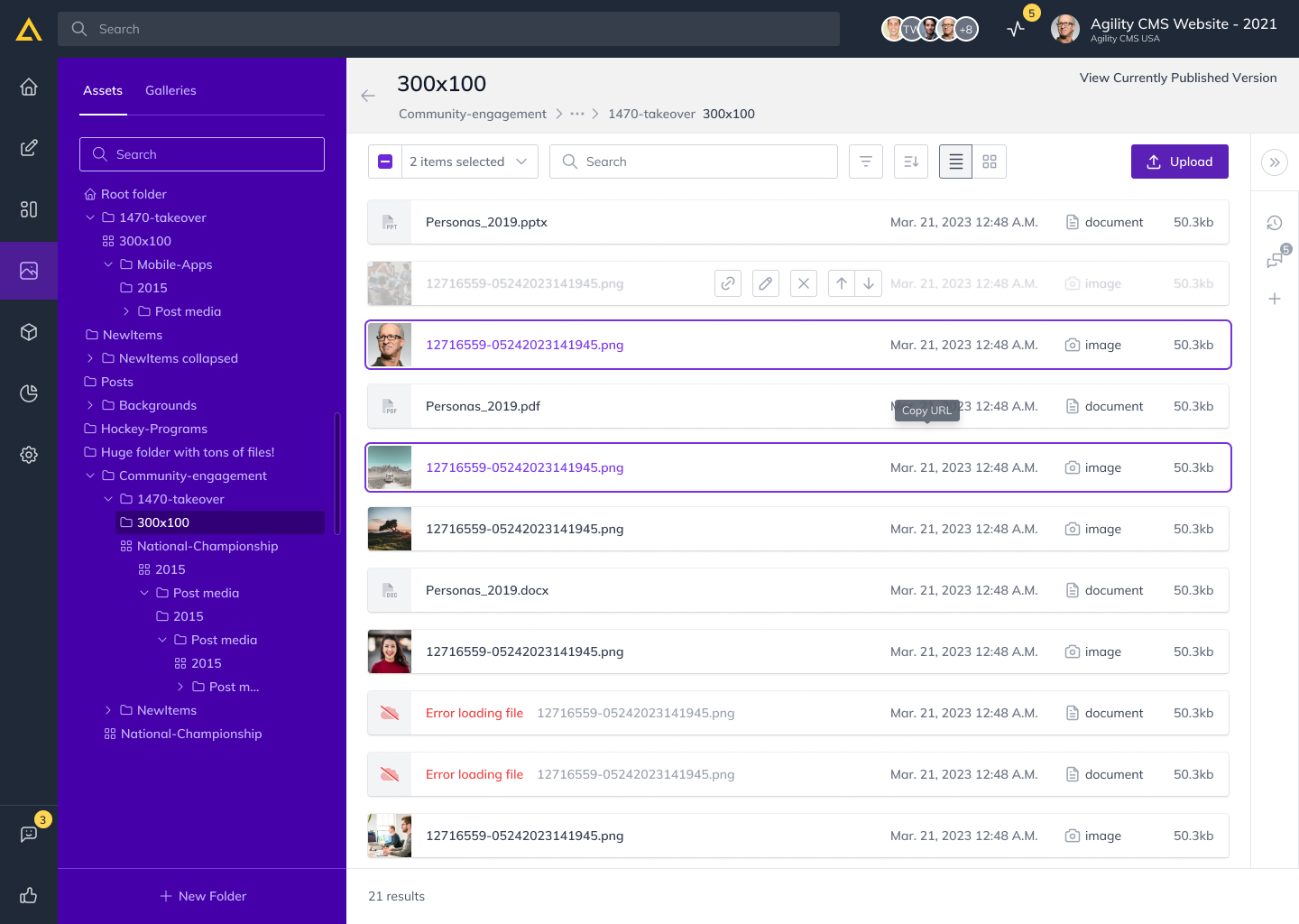
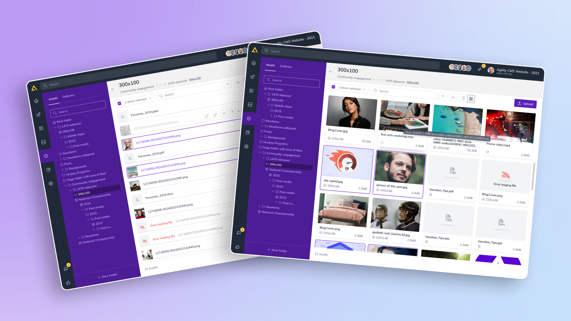
Digital Asset Management: The digital asset management area received a clearer structure, improving file handling and organization, allowing users to manage assets more efficiently.
Flexible Layouts: Based on user feedback, we introduced flexible layouts, giving users greater control over content presentation and allowing them to tailor the CMS to their unique needs.
Advanced Search: An improved search feature addressed common search challenges, with added filters that made it easier for users to locate specific content.
Initial concepts
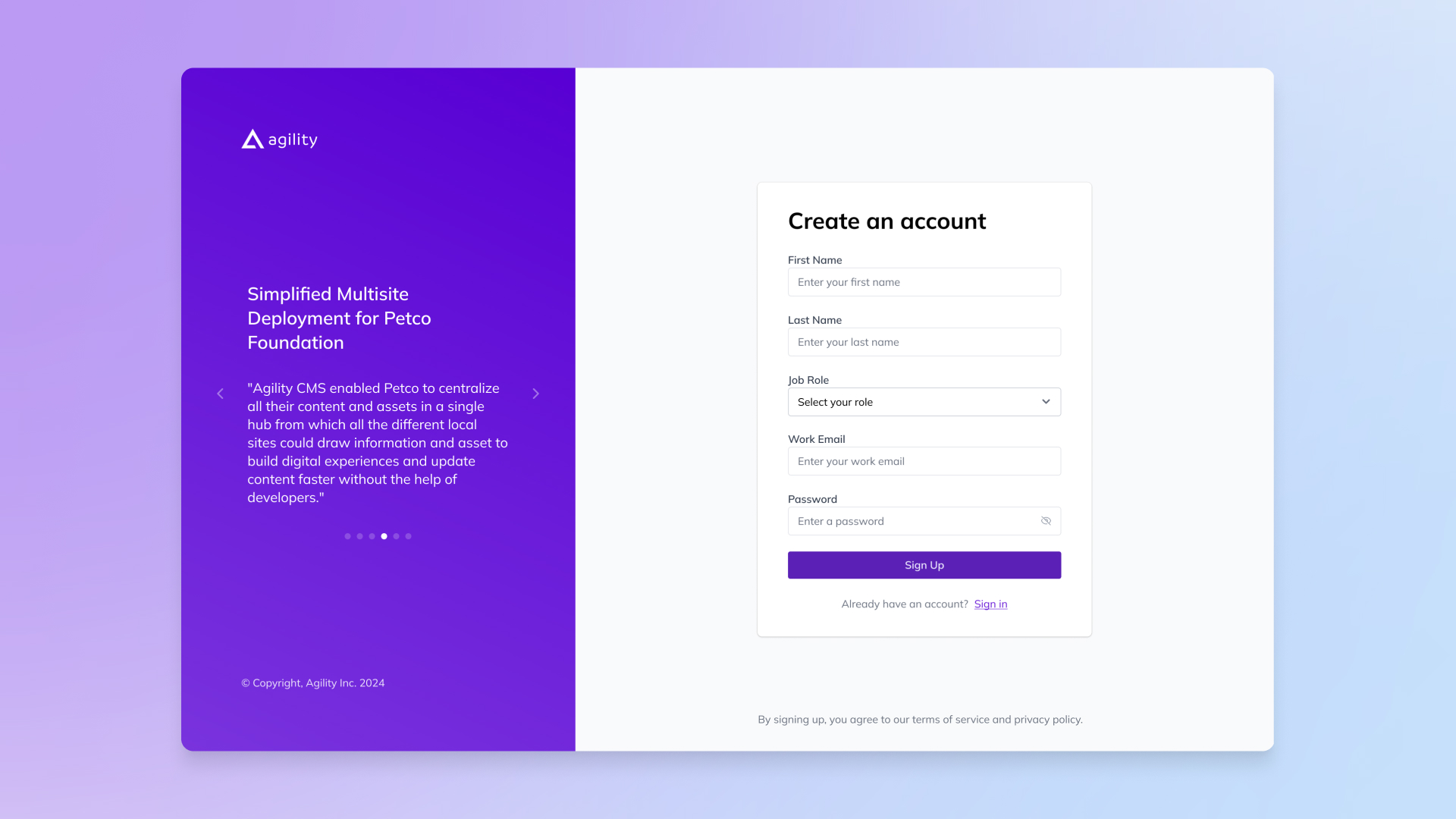
The simplicity and security seemed to be prime concepts for the first set of redesigns. The signup and login screens were split-screen, having security elements such as encryption, and a content carousel. These screens included fields for job role personalization, password recovery options, single sign on and visual security cues to improve the start experience for this set of users. In the content management view, we improved on color palette, streamlined navigation and gave a clean global search function to enhance the ease of use as well as the functionality.
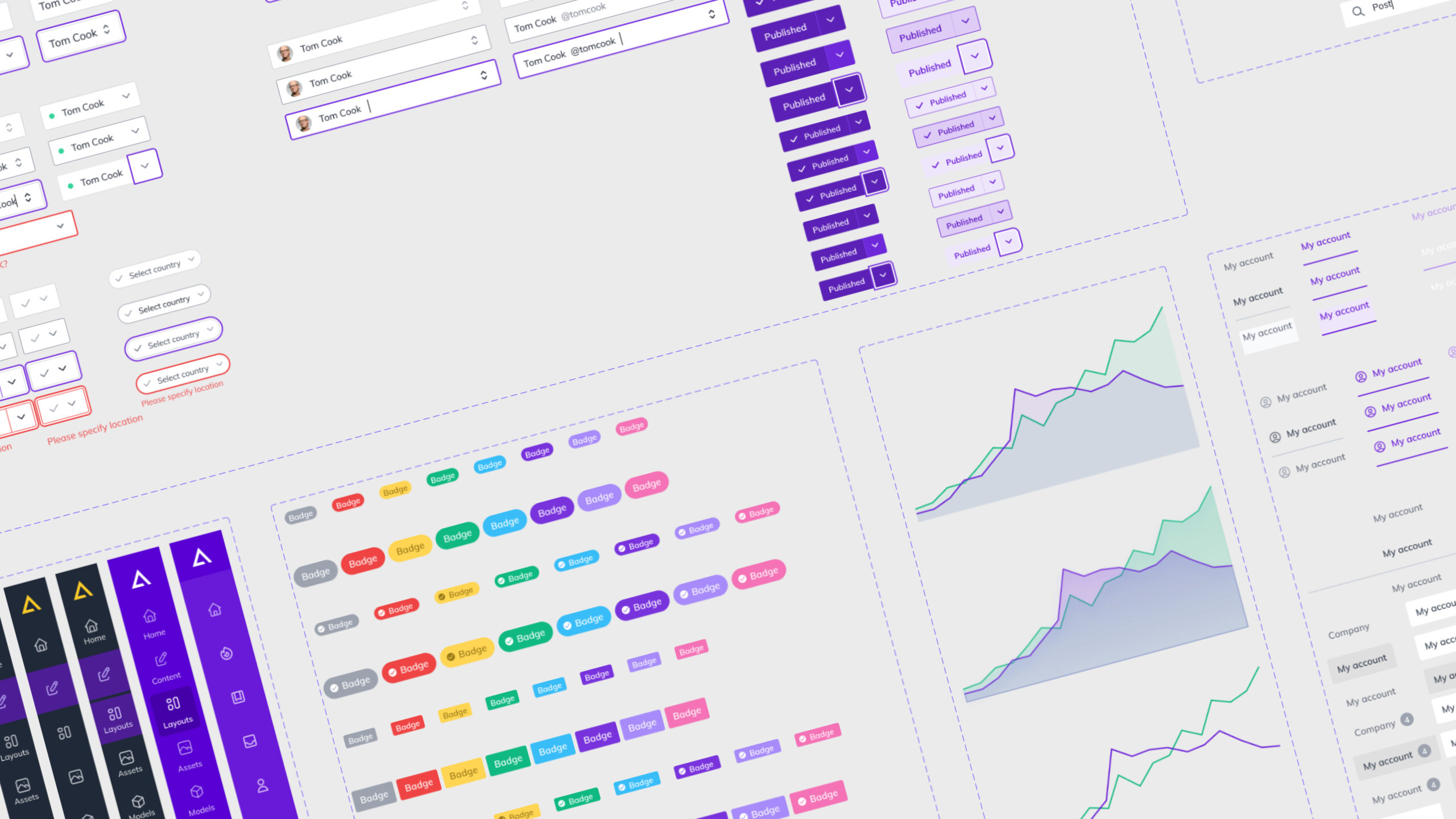
"Plenum" design system
The “Plenum” design system developed for the CMS gave working, visual and productive consistency, going a long way toward unifying the visual and functional aspects of the CMS. Plenum was implemented as a cohesive and flexible design language to allow for future as well as current growth.
I began by analyzing design trends to identify essentials for the CMS, focusing on creating a simple, user-centered experience.
We defined core principles of simplicity, scalability, and usability, creating a clear foundation for the CMS’s visual identity.
Components were developed to be reusable and aligned with Plenum’s principles, ensuring consistency across the CMS.
Integration guidelines outlined how to apply the design system effectively, helping maintain cohesion in each section of the platform.
Collaborative refinement brought in team input, allowing the system to evolve based on feedback from both team members and users.
Education and advocacy ensured the entire team understood and adopted Plenum, embedding it into the CMS’s development process.
Crafting a User-Centric CMS: Goals and Execution
Improve UI and UX for a seamless, consistent experience.
Build a scalable design system for cohesion and flexibility.
Add user-centered features to boost engagement.
Design intuitive interfaces for natural navigation.
Incorporate feedback loops for continuous improvement.
Make the CMS both powerful and enjoyable to use.
Set a new industry standard in user-focused design.
To ensure design and development were able to work together we used Storybook to solidify Plenum’s components in a live environment.
Storybook gave teams the ability to build and test components independently and that could then be reused across the platform ensuring consistency, assuming that there would also be a flexible, reusable component library as the CMS grew.
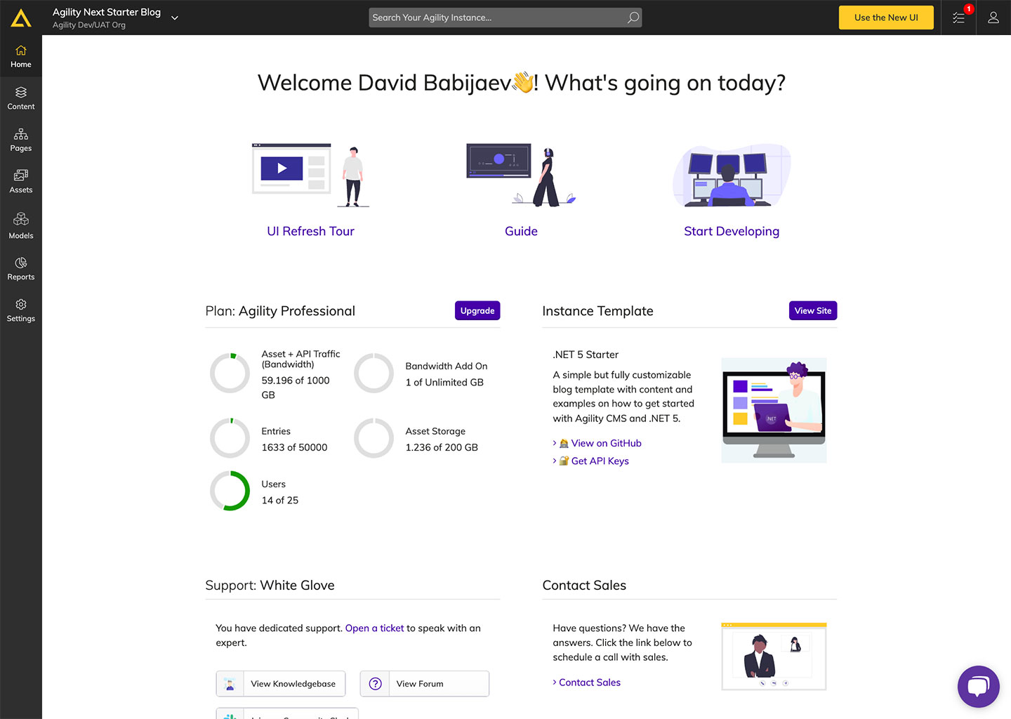
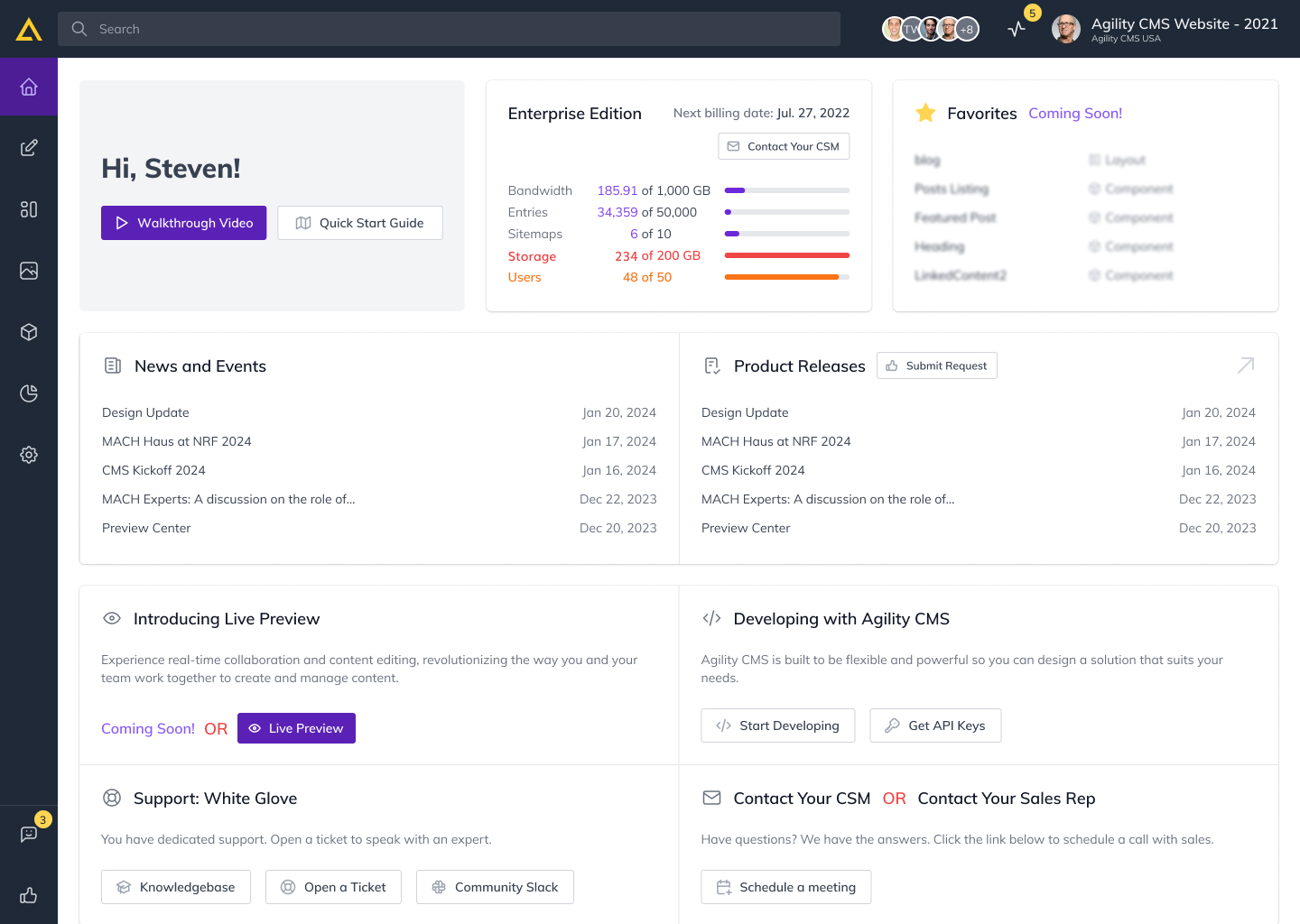
Home dashboard
Targeting Home Dashboard for Headless CMS, the goal was to make the starting experience more engaging and faster for users. The project wasn’t focused on just a visual update, it was about simplifying navigation and to make some of the most important content more accessible to the user type. I considered what people needed, what they would and wouldn’t want to do, and designed a simple, clear layout so people could do the things they needed to do in the time they had. By redesigning this, we improved usability and made it so users could log in and start each session with clarity and with a more smoothly flowing workflow.
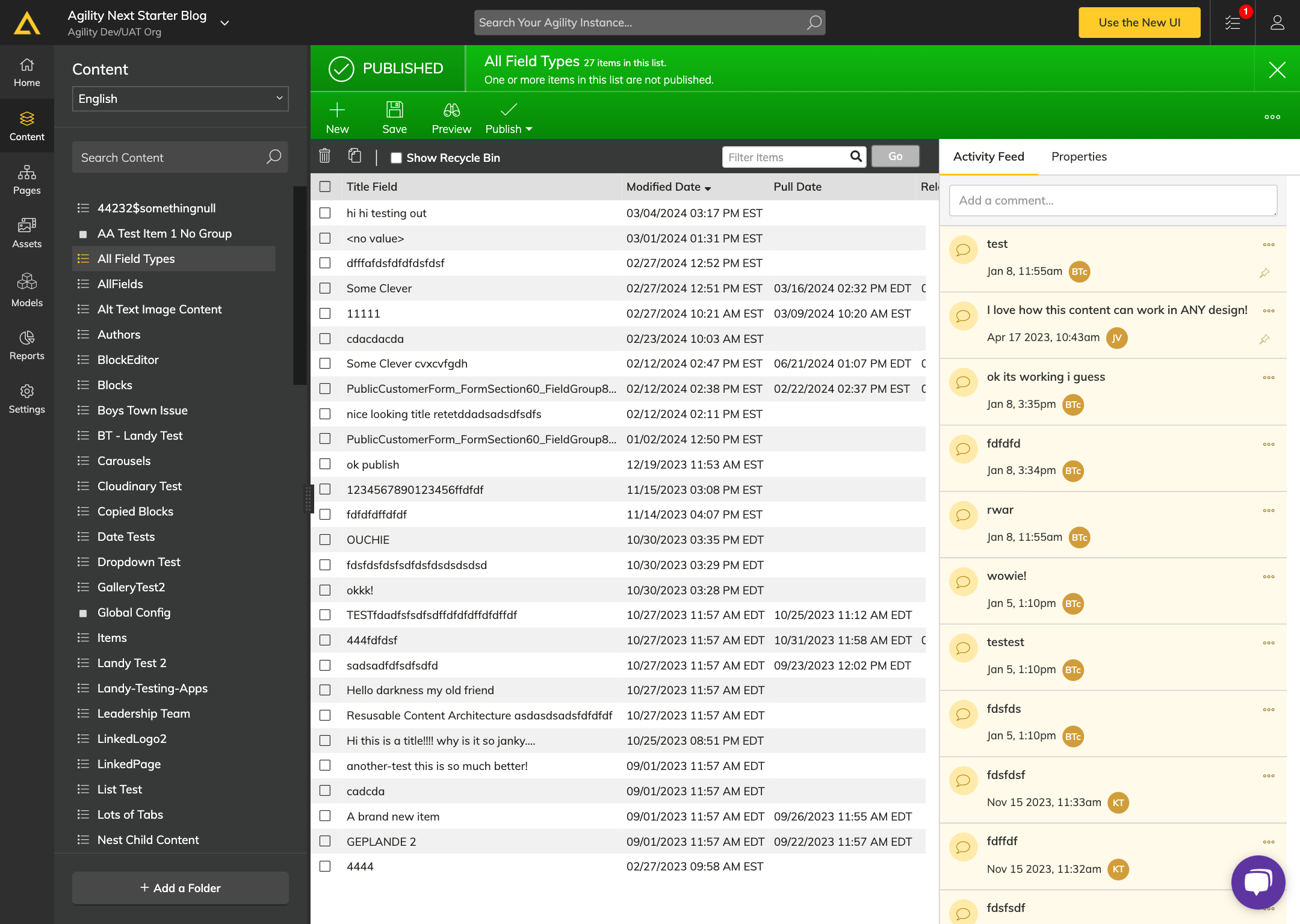
Content Management
The drive behind the Content Management screen redesign was an assessment of what users required on the content to navigate it easily. Then, I wanted to create a natural space for content creators and developers who can focus on simplifying the interface and organizing the content. I was able to refine workflows with direct feedback from users, enabling users to get their work done with fewer steps and more confidence. They redesigned this so that functionality and visual appeal came together, resulting in content management being a simple, pleasurable part of how they spend their time on the platform day to day.
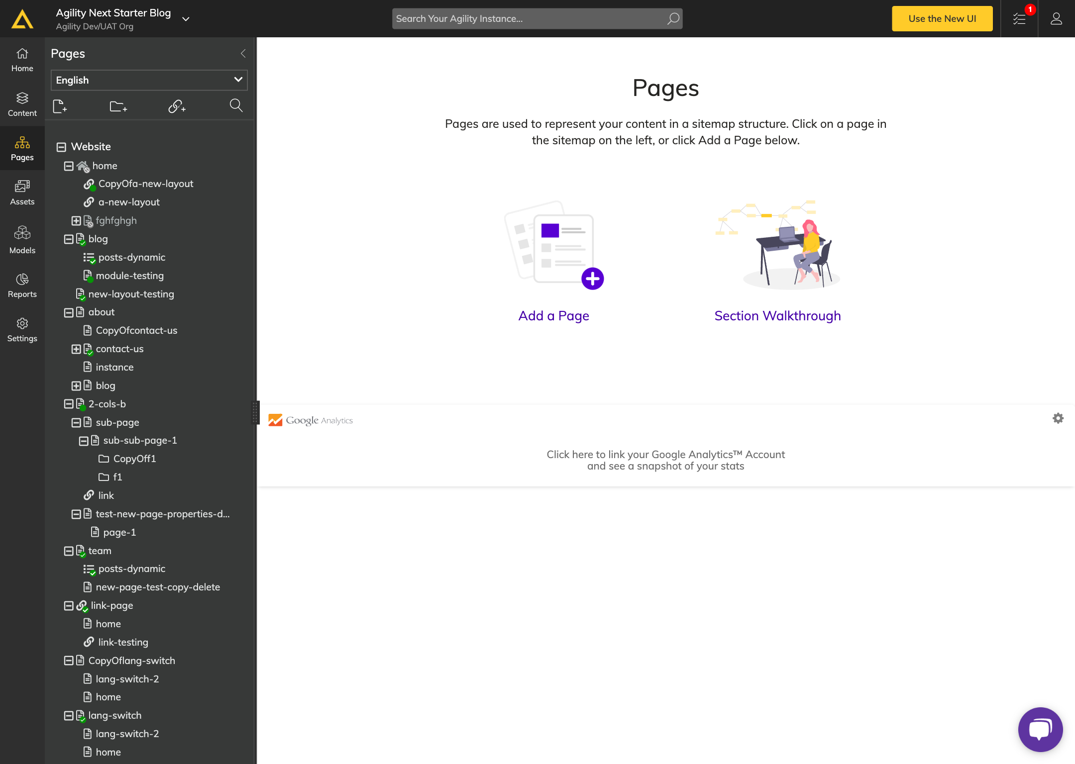
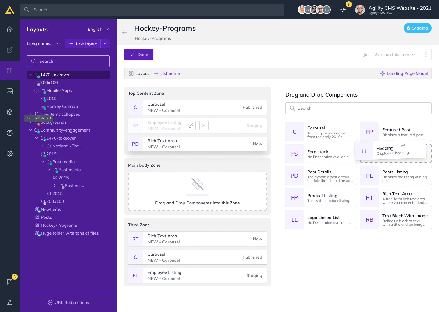
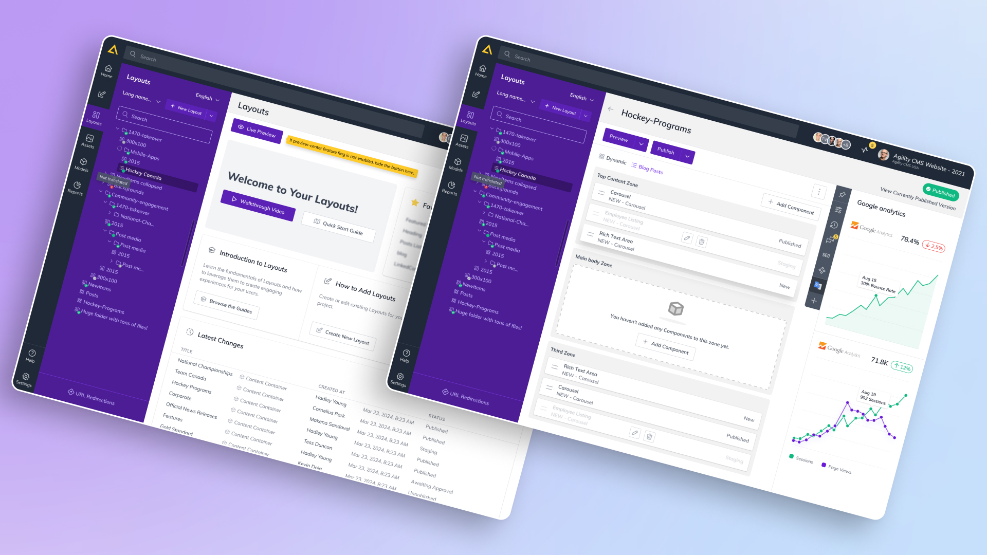
Pages -> Layouts
The most radical change was to turn what was referred to as the ‘Pages’ section into the ‘Layouts,’ because it meant that the CMS structure reflects how the user thinks about content. The rename was much more than just a rename, instead it required thinking about the design and interaction model to better fit the structure of site content. By incorporating drag-and drop capabilities, users could now more intuitively situate and view their content hierarchy. Thus, the easy way of structuring or modifying and moving layouts made it possible for users to experience using the CMS in ways that are more in line with how the architecture largely operates.
Digital Assets Management
First, DAM was retooled to address how users used and work with their media, and second, it was about making asset management more efficient. For the user flows, I concentrated on streamlining them, making filtering and category more intuitive and making it clear across all types of media. Users could quickly see and manage assets by seeing clearer visual states and had simpler filtering options. The purpose of this redesign was to bring asset management seamlessly inline with the rest of the CMS workflow, so users can move freely through their media libraries.
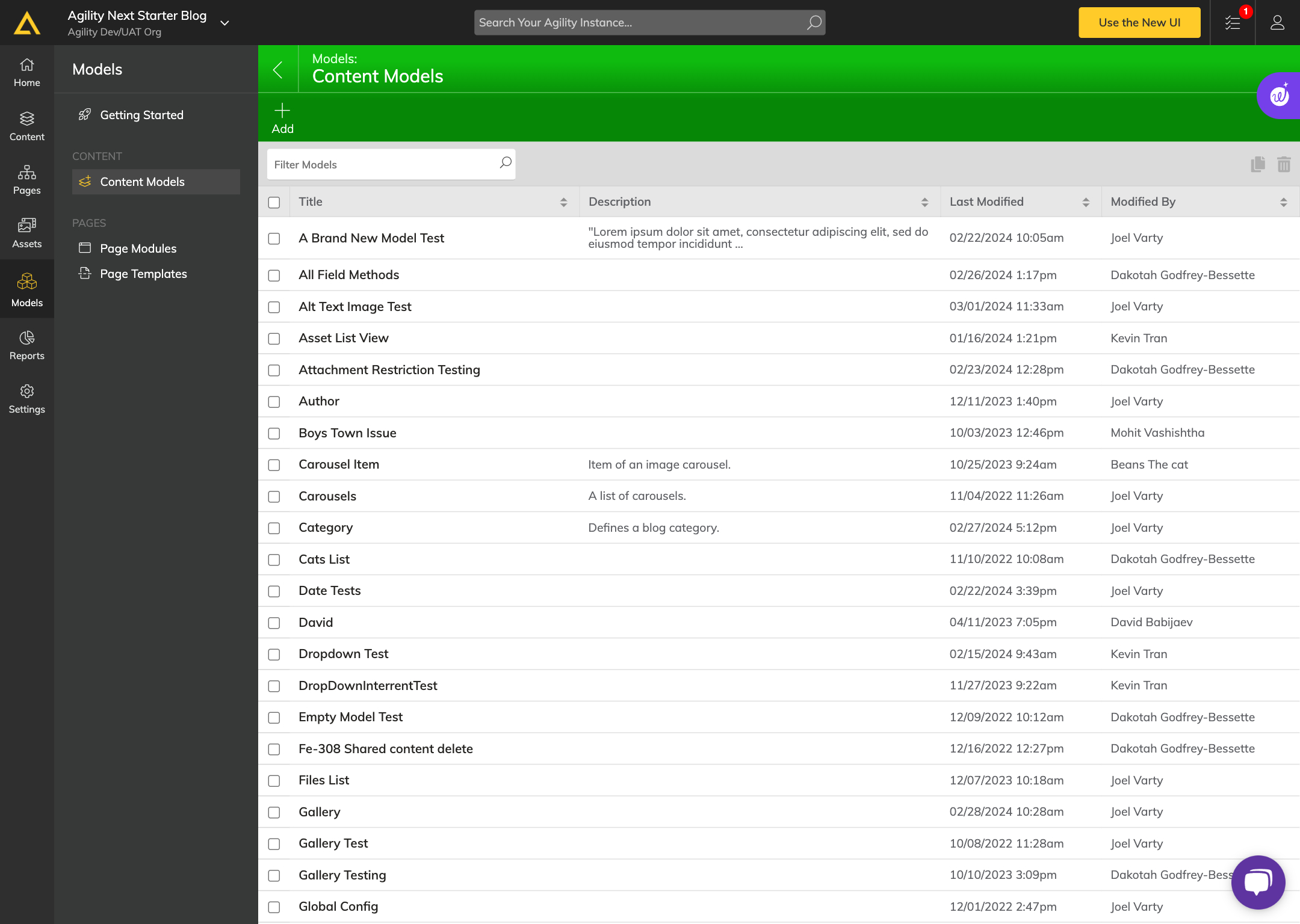
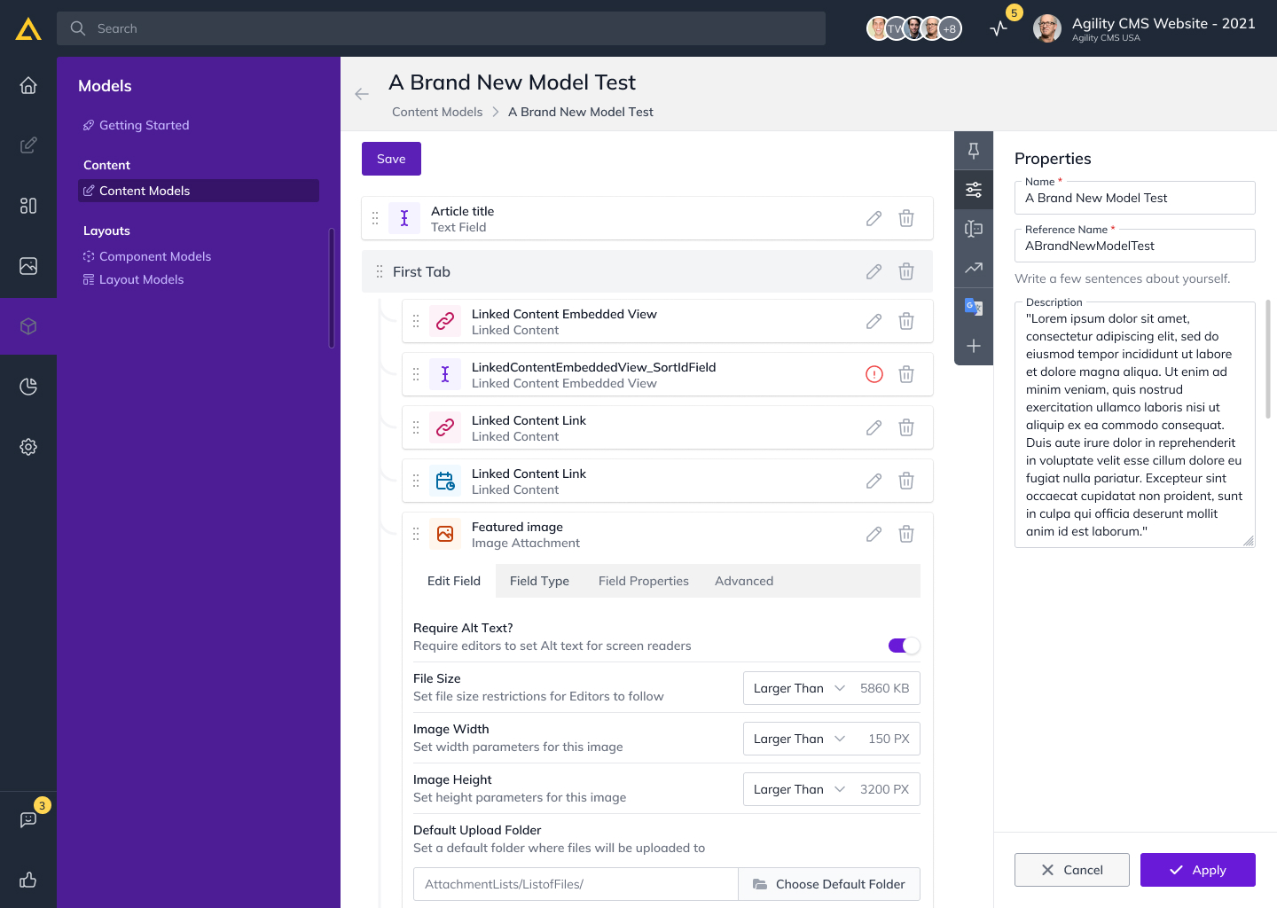
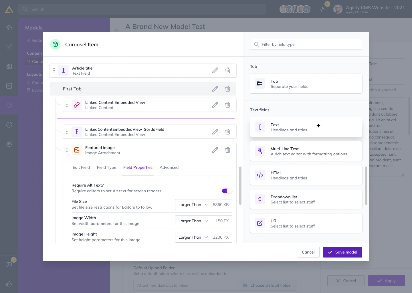
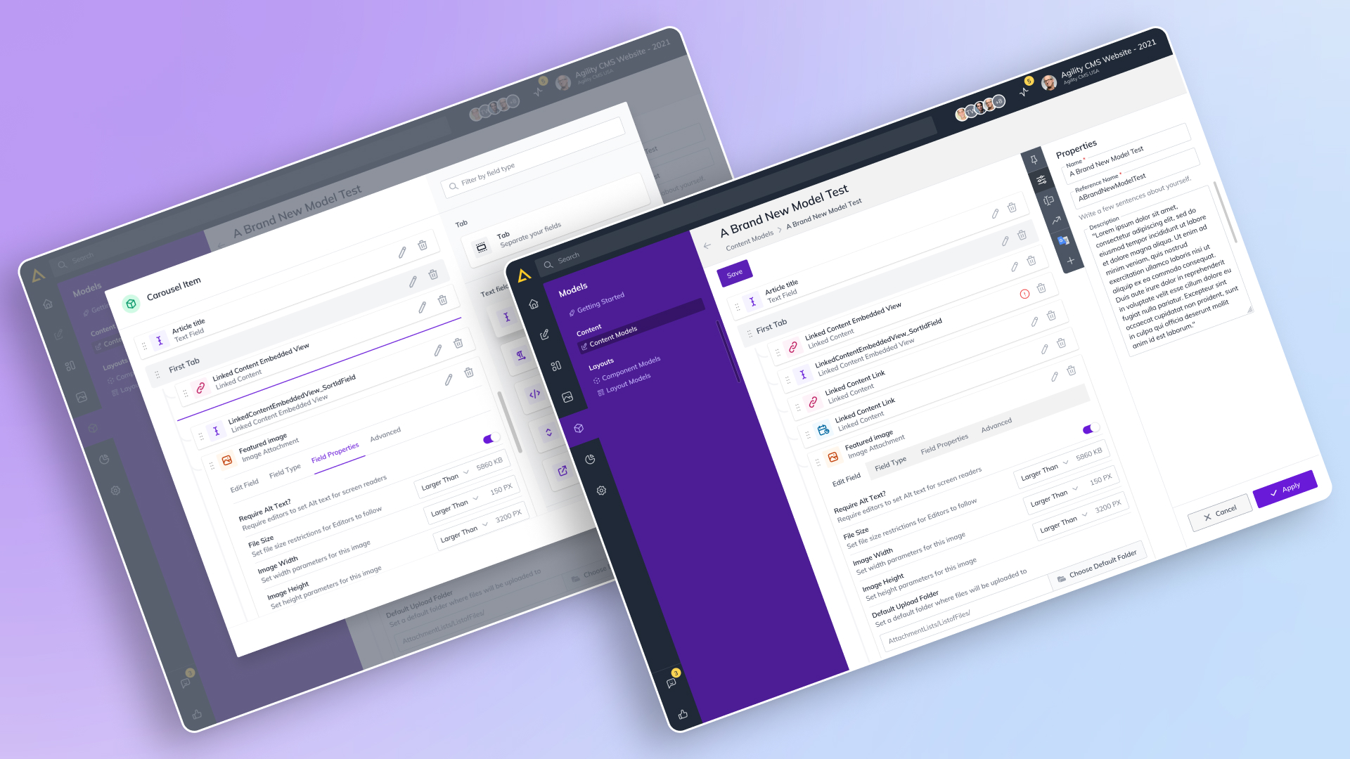
Models
One of the ways the Models section redesign introduced a visually interactive way for users to manage content hierarchies. Using a drag and drop interface to reorganize content models became easier, giving users a faster, more intuitive experience. Users gained a more active role in understanding and using complex data by visual mapping model relationships to see and thus understand model content structures at a glance. The update streamlined user experience in terms of managing the digital ecosystem, with more clarity on how content models link and relate with each other from Headless CMS.
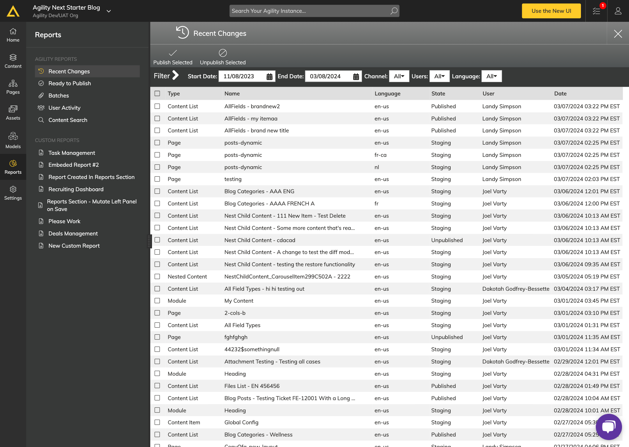
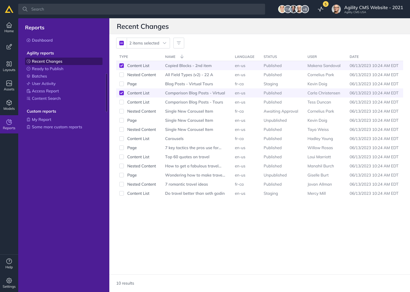
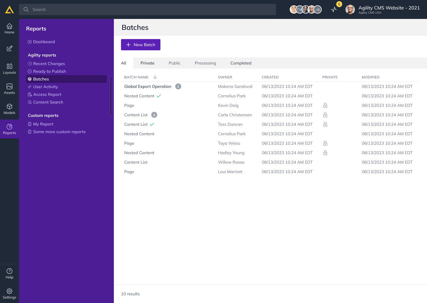
Reports
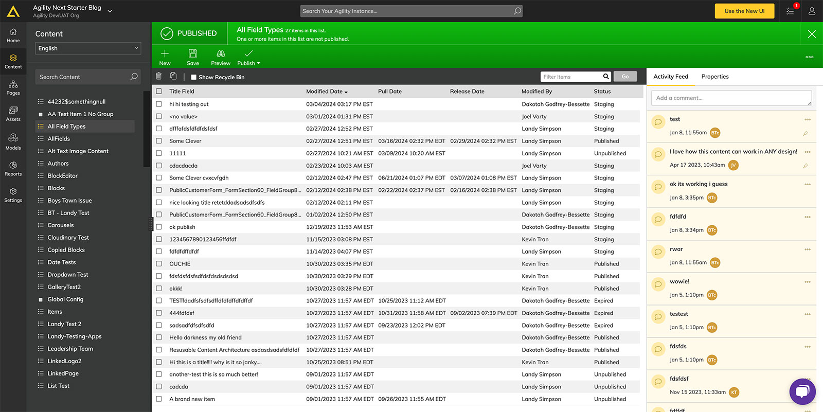
Users enjoyed the redesigned Reports section which let them gain an even better overview of their content and activity across all of their areas: “Recent Changes,” “Ready to Publish,” “Batches,” “User Activity,” and “Content Search.” The focus was on making data more accessible and organised, in order to provide users with better opportunities to develop deeper insights about their content workflows. Now this section provides a clearer, more efficient method of managing track of progress and content in support of a more active approach to content management.
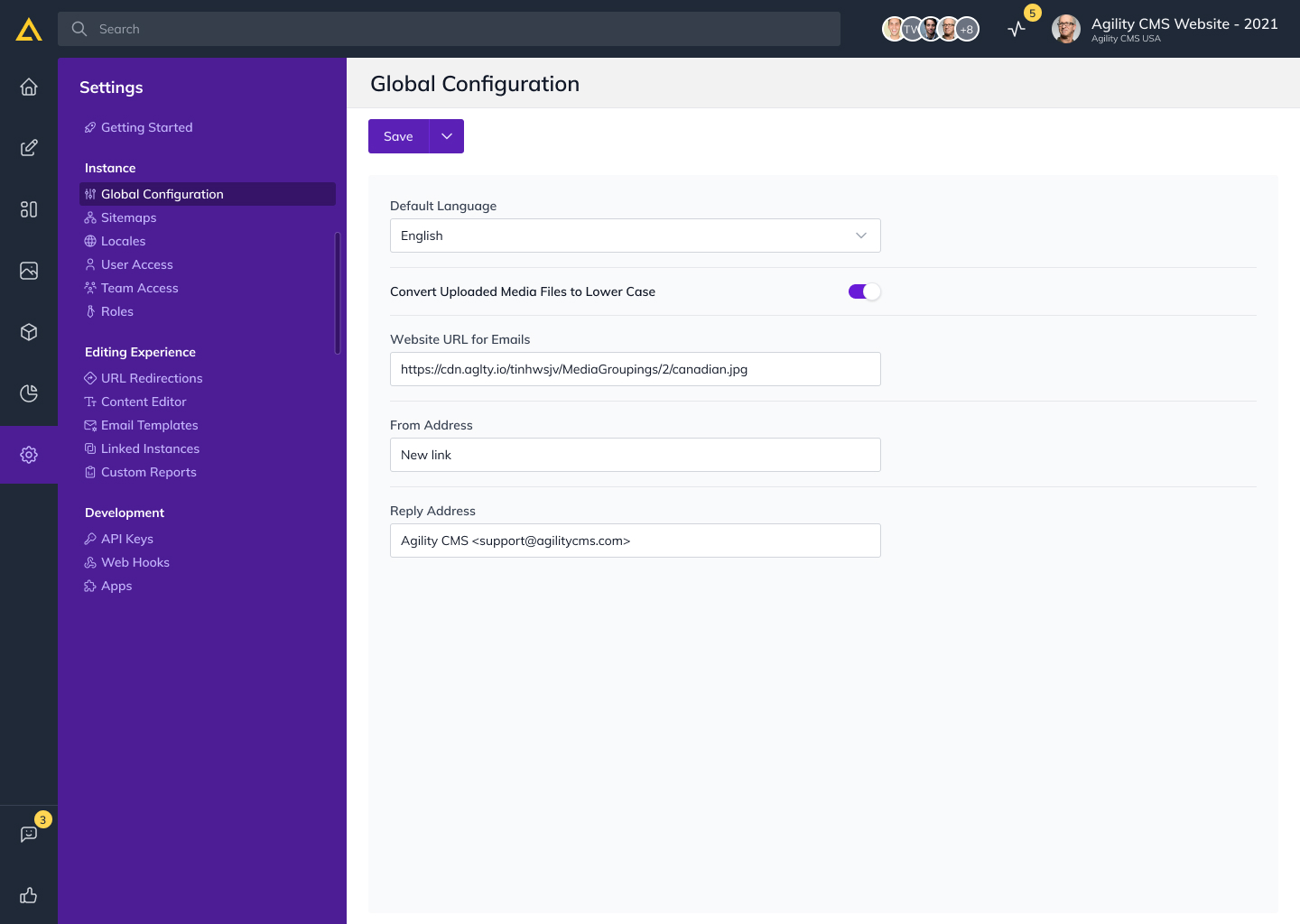
Settings
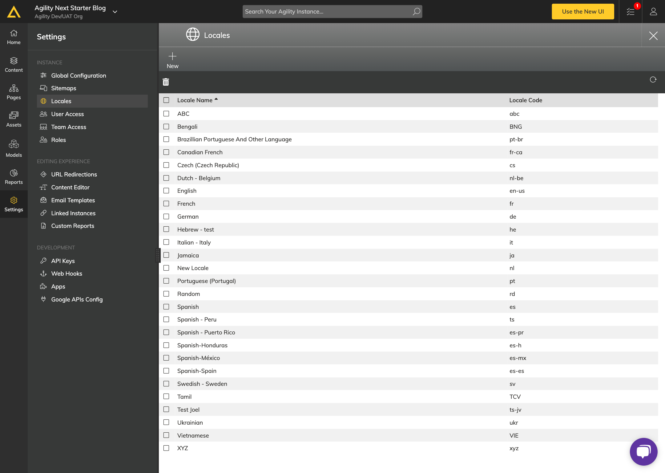
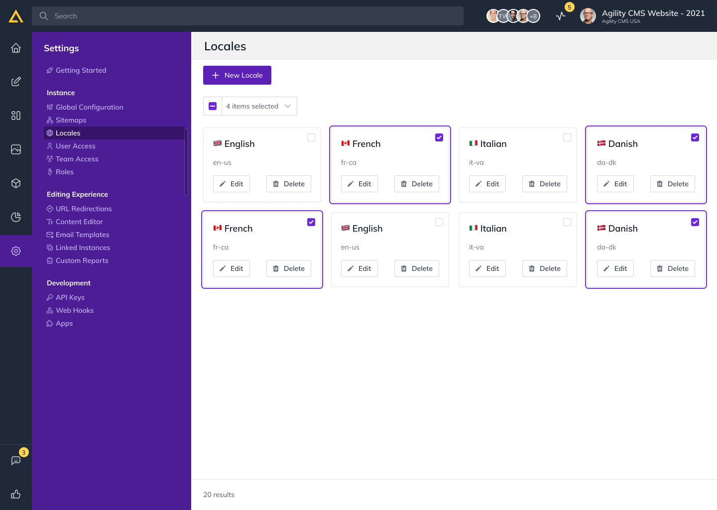
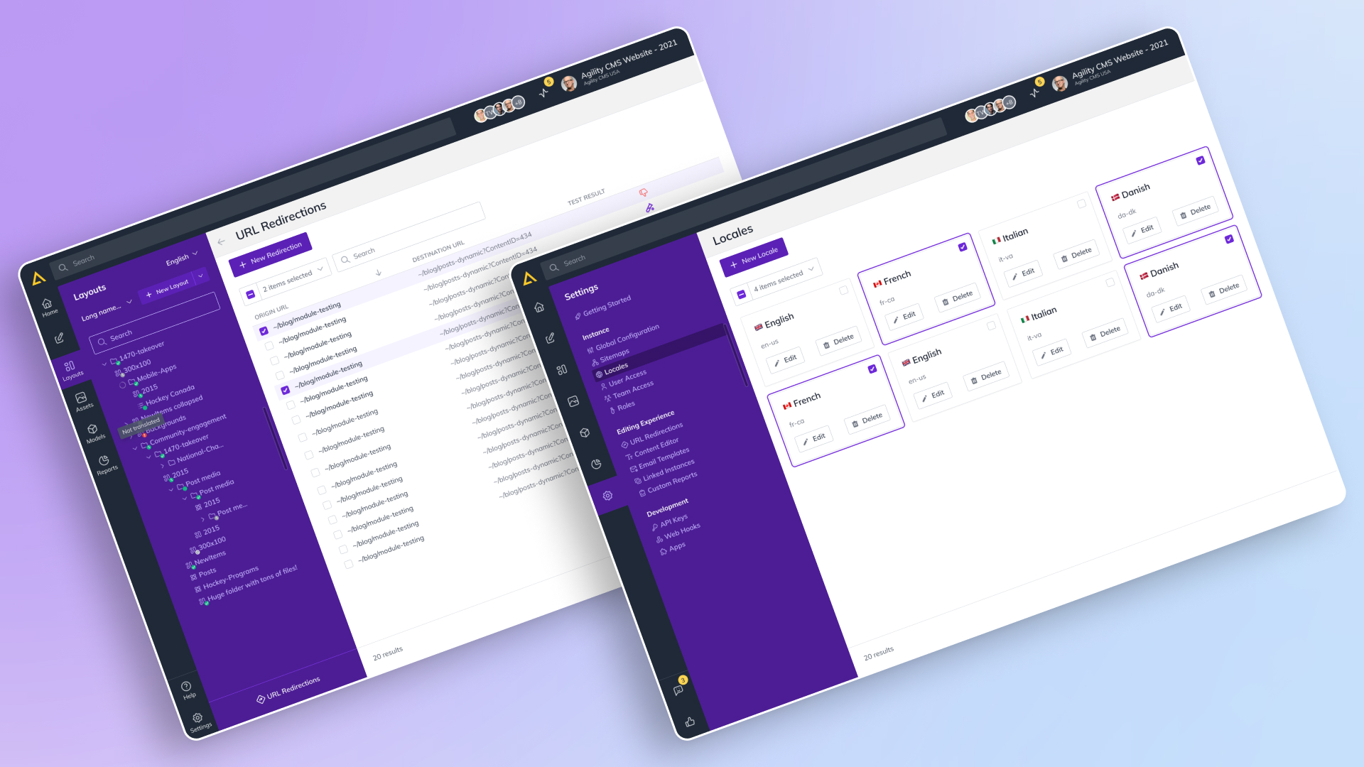
The Settings section was completely overhauled and it enhanced user control and helped with site management in a much cleaner way. Enhancements to functionality for managing Global Configuration, Sitemaps, Locales, User Access, Team Access, and Roles improved upon the basic layout, making the CMS more intuitive to use without changing any functionality. The new design makes these configurations more accessible, which makes the workflow in the platform appear smoother and helps create that collaboration through the platform, so users can manage permissions and adjust site settings on the fly.
Results and takeaways
Outcome
In the beginning, the Headless CMS redesign was user research lite, limited to a simple UI refresh, but with the addition of a live feedback loop post launch, grew in depth and purpose. It marked a pivotal stage in the project, started a close working relationship with stakeholders, and aligned product development directly with user insight. This connection established established an anchor for the CMS to respond to user needs, provide real world feedback, then iterate by consulting.
Contrary to this outside user interviews were very limited, with overall progress from an inclusive and efficient design made considerable with the help of the feedback loop and ongoing “Pixel Perfection” workshops. Through these workshops, design and development worked very closely together, and the interface was refined in ways that users found intuitive, engaging and empowerment. It brought to light the importance of user generated insights and collaboration, which ultimately led to a CMS which served the needs of its users better.
Conclusion
It started as simple as upgrading Headless UI and evolved to a railroad of adaptability and user centered design. Though it is a case study reflecting how this project evolved from user empathy, stakeholder collaboration and a conscious understanding to elevate the user experience creating of content and the team that ensures that it happens the first time, every time.
The Headless CMS User Experience Redesign is about how a product/design thinking approach incorporating empathy and strategic decision making can result in a responsive, user focused approach. The project encapsulates how the thoughtful adaptation to each phase grounds in user feedback not only meets but exceeds user expectations. This story shows how a structured, feedback-based process was used to create a product that is prepped to jump with its users as they grow and future needs arise.