Sector HVAC manufacturer Industrial Air curtains Research and development
Challenge
To develop first-of-its-kind multi-platform applications for managing commercial HVAC units via the IoT cloud, aiming for comprehensive control of units at various sites. The challenge involves enabling control over temperature, fan speed, and more, to enhance brand visibility.
My role
As the Product Designer, I led the design of these applications, integrating various connectivity technologies for seamless IoT cloud interaction. I focused on creating an intuitive user interface that ensured easy and efficient control of HVAC features
Success Metrics
The project’s goals were to allow remote HVAC adjustments without physical contact and to integrate all units via Bluetooth to a single business account, accessible through web or mobile dashboards, aiming to boost operational efficiency and user experience.
Design Process
To understand the user needs and the technological limits, the design process required comprehensive research. To this end, I began by searching for users’ needs before engaging in innovative thinking. In my testing of wireframes and prototypes, which I constantly refined, I made sure that they were usable and effective. All the way through this process, collaboration with cross-functional teams enabled a comprehensive approach to designing products by involving end users directly as well as considering the practicality of various concepts. It was not only a solution to problematic issues but also a driving force behind breaking new grounds that led to a user-centered, technologically advanced product.
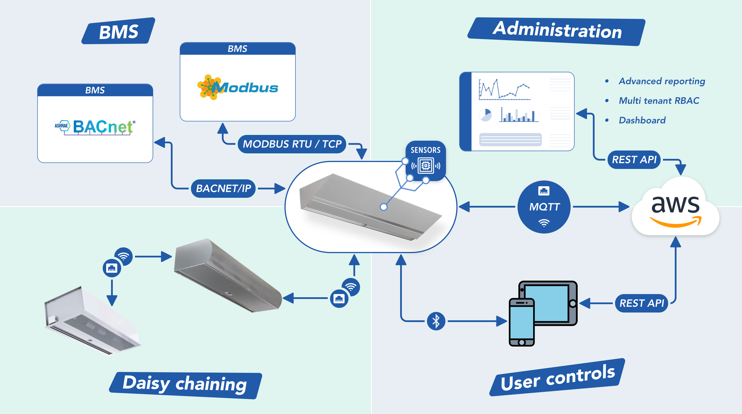
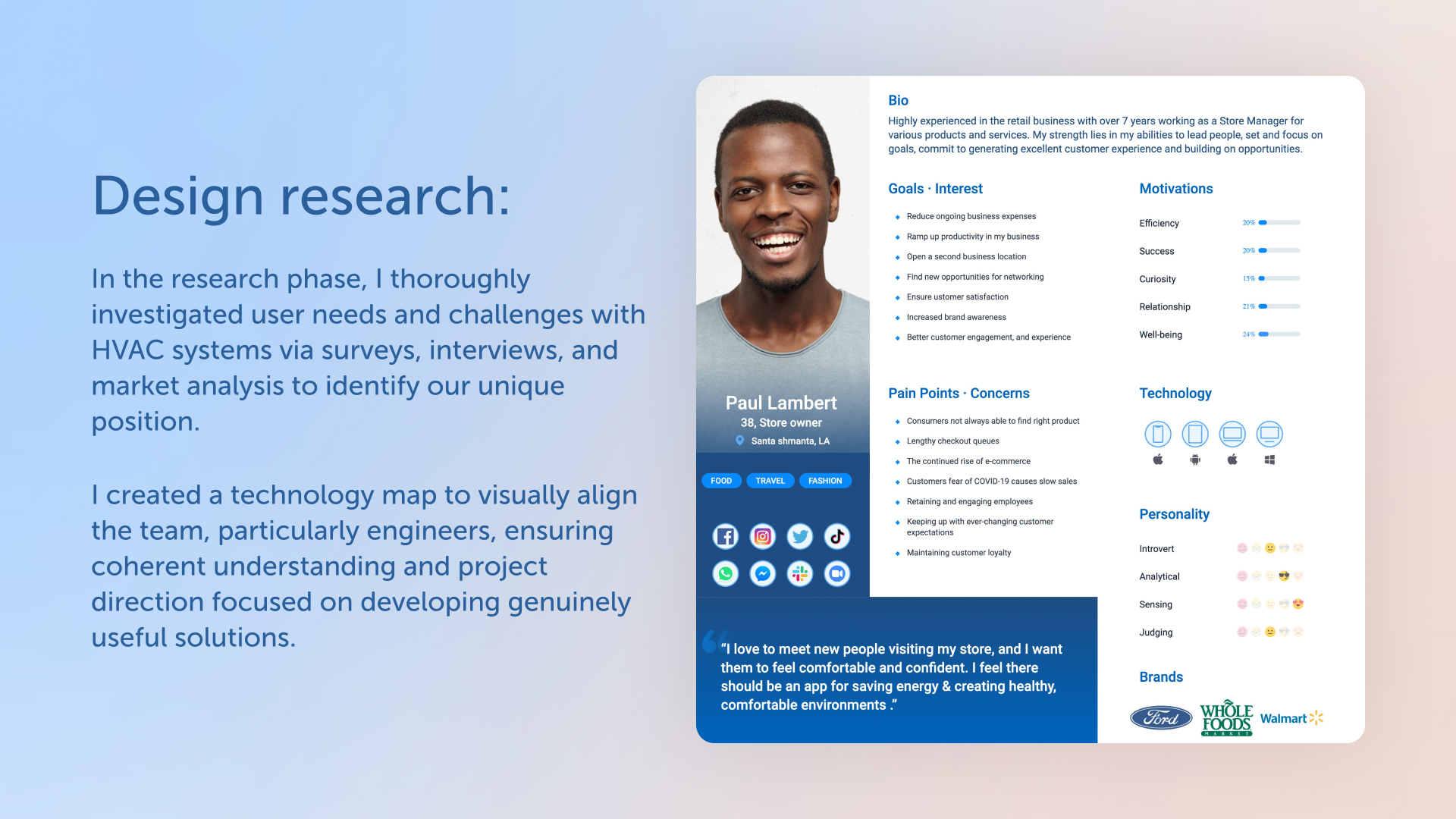
Research
During the research stage, I dove deep into understanding what users really needed and the hurdles they faced with their HVAC systems. Through a mix of surveys, interviews, and a look at what the market was doing, I got a good grip on where we could stand out. I also put together a technology map, kind of like a blueprint, so everyone from the team, especially the engineers, could visually get how everything was supposed to work together. This step was key in making sure we were all on the same page and helped steer our project in the right direction, making sure we were building something that people would actually find useful.
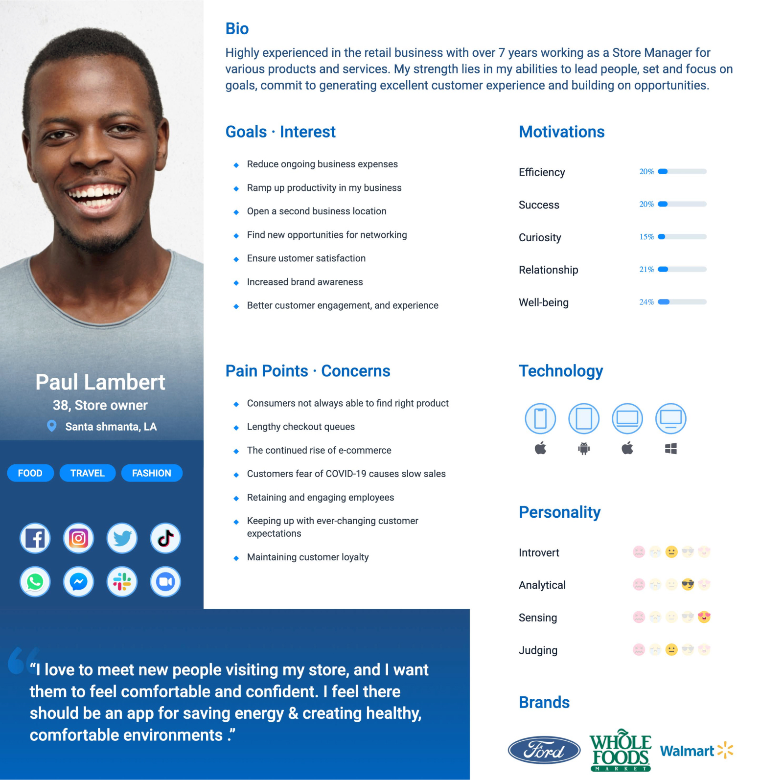
Persona
Creating personas was like drawing a map to our users’ hearts and minds. I pieced together their stories, goals, and daily battles from our research, giving life to characters that represented our audience. These weren’t just sketches; they were the heart of the project, steering every decision to make sure I was not just building something cool, but something genuinely useful for real people. Through these personas, I made sure the design stayed grounded and focused on what matters most – making life easier for those I’m designing for.
User Flow design
In crafting the user experience, I developed flow maps for key interactions: User Onboarding, Unit Pairing, and the General Flow of the app. Starting with User Onboarding, I designed a welcoming process that guides new users through setting up their account and getting familiar with the app in a friendly, efficient manner. For Unit Pairing, I mapped out a simple, step-by-step process to connect HVAC units to the app, ensuring it was straightforward and foolproof. The General Flow map tied everything together, showing how users move through the app to access different features and settings. Each map was carefully thought out to remove any guesswork for the user, making their experience as smooth and enjoyable as possible.
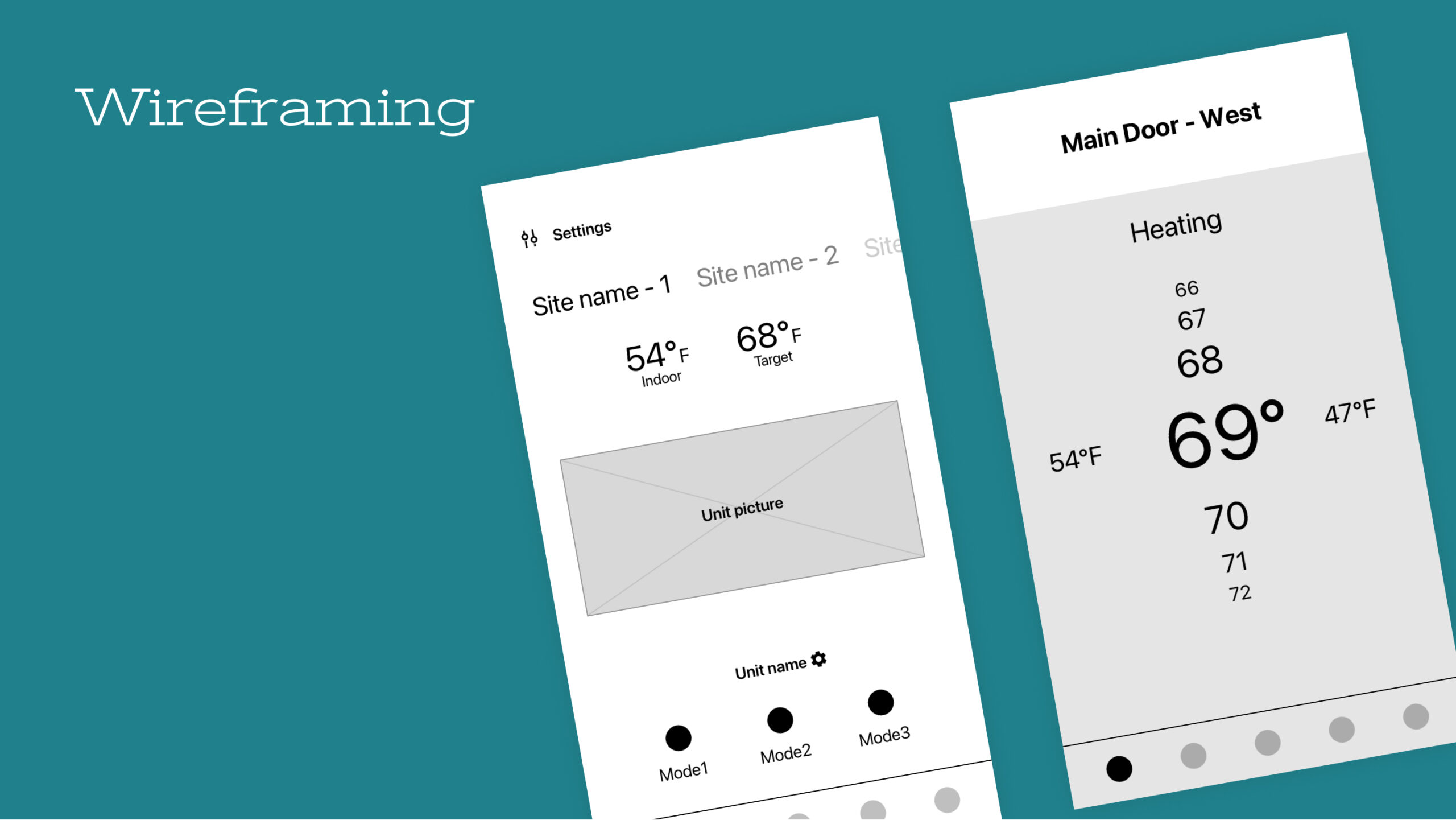
Wireframing
In the wireframing phase, I dove into sketching the app’s skeleton. It was like drawing a map for our digital world, focusing on where everything should go—thinking about how users would navigate without getting lost in the design details. This stage was all about making sure that when someone uses the app, they’d find it intuitive, like everything was just where they expected it to be. Wireframing wasn’t just about lines and boxes; it was my way of laying down the groundwork for a smooth journey through our app, ensuring users would feel right at home from the start.
Results and takeaways
Since the launch of the new rebuild of the corporate website, we’ve seen a significant decrease in the bounce rate logged through the visitor behavior analysis. Also, I have received positive feedback from users about the streamlined navigation through the website and better content scanability, enabling smoother and faster product searches, saving them time and effort. Some mentioned that the website looks and feels more polished.